September 30, 2009

Modern Women and Parisian Consumer Culture in Impressionist Painting

H-Net Reviews:
Ruth E. Iskin. Modern Women and Parisian Consumer Culture in Impressionist Painting. Cambridge: Cambridge University Press, 2007. 288 pp. $96.00 (cloth), ISBN 978-0-521-84080-4.
Reviewed by Charlene Garfinkle (independent scholar)
Published on H-Women (March, 2009)
Commissioned by Holly S. Hurlburt

Painting Commodities
One might not automatically think of mass production and consumer culture when contemplating a painting by Edouard Manet, Edgar Degas, or Claude Monet; but, according to Ruth E. Iskin in her book Modern Women and Parisian Consumer Culture in Impressionist Painting, certain works by these and other impressionist artists cannot be completely understood without an investigation of this relationship. Iskin considers mass production and consumption in mid- to late nineteenth-century Paris and the rise of the female consumer for their possible influences on impressionist paintings of goods for sale, shop windows and shop clerks, village markets, and fashionably dressed women. Using Charles Baudelaire’s essay “The Painter of Modern Life” (1863) and Emile Zola’s novels Le ventre de Paris (1873) and Au bonheur des dames (1883) as mirrors of modern Parisian culture, the works of Manet and the impressionists become examples of or counterpoints to these views of what is modern and what the changing condition of consumerism means.

Iskin’s book is a provocative study, broadly researched in theories and practices of the time and drawing on contemporary fiction and writing by art critics and artists to recreate the cultural aura of this period in Paris. Most satisfying are her discussions of “What is modern?” not only in the visual arts but in the wider scope of popular culture. “Print media images flooded everyday life in various forms.... Thus, avant-garde art during the Impressionist decades was being formed in the midst of radical changes not only in the mode of consumption but also in the visual culture that increasingly permeated modern life, linking it to consumption” (p. 2). The relationship between print media and impressionist painting has been well established. What Iskin offers in her study is the connection of the printed by-products of consumer culture--advertising images, such as posters, fashion plates, and department store catalogue illustrations--with the subject matter of impressionist art. Iskin’s use of art critics to cast light on the existence of this relationship, and place her arguments into a cultural context, makes interesting reading and proves her point that the influence of consumer culture was blatantly present in these paintings although not always appreciated by some contemporary critics.

Chapter 1, “Introduction: Impressions, Consumer Culture and Modern Women,” sets the goals of the book and also introduces a discussion of the female gaze and spectatorship as it relates to bourgeois cultural consumption. Putting a new twist on Laura Mulvey’s “male gaze,” Iskin shuffles the deck on the gaze by presenting the modern woman as an object taking an active role in both sides of consumption. “By considering modern women’s roles not only as passive icons that sell commodities but also as active producers, consumers and sellers, I argue that certain paintings by Manet and the Impressionists represent modern women’s agency and inclusion rather than passivity and exclusion from the public spaces of modern Paris” (p. 23). Iskin makes the point that women are both consumers in this age of mass production/consumption and objects on display. Therefore, women can be depicted both looking and being looked at in impressionist painting. An intriguing analysis of a group of paintings by Mary Cassatt ends the first chapter and sets the scene for the next.

“Selling, Seduction and Soliciting the Eye: Manet’s Bar at the Folies-Bergère” (1882) focuses on the “still-life” of bottles on the counter in this painting as representing commodity display. This chapter is a reprint of Iskin’s article published in The Art Bulletin in 1995 and fits nicely into the theme of this larger study. It adds another level of interpretation to the extensive literature on Manet’s A Bar at the Folies-Bergère. Included here is the commodity aspect of the liquor bottles and their clearly readable labels as well as an intriguing explanation of the spatial “incoherence” in the painting, which Iskin attributes to Manet’s use of several viewpoints, including the “single male gaze,” “female spectatorial gaze,” and “crowd spectatorship” (p. 55).

Iskin’s most original contribution is in chapter 3, “Degas’s Dazzling Hat Shops and Artisanal Ateliers: Consumers, Milliners and Saleswomen, 1882-c.1910,” where she groups Degas’s millinery shop subjects (the first study of these works as a whole) and interprets them “in the historical context of Parisian culture of feminine fashion consumption and production” (p. 61). Iskin views these works from all angles, including the literary influence of Baudelaire, gender and class issues of depicting bourgeois women consumers, the modiste as artisans and working-class salesgirls, and the manipulation of the composition to feature the commodity display of hats as subject in light of “the new display strategies developed by department stores to attract customers” (p. 93).

“Inconspicuous Subversion: Parisian Consumer Culture in 1870s City Views” is the topic of chapter 4. Here Iskin takes a new look at city views by Gustave Caillebotte, Pierre-Auguste Renoir, Giuseppe de Nittis, Manet, Degas, and Monet, going beyond the effect of the Haussmanization of Paris by “analyzing representations of specific sites of the Parisian culture of consumption, such as storefronts, shop signs, shop displays, and various advertisements in the paintings of Manet and the Impressionists, particularly in the city views of the 1870s." She "contextualizes the works within the contemporary cultural discourse of consumption and critical response to the artworks” (p. 115). This was one of the less satisfying chapters due to the conflation of ideas--there are “both explicit and implicit signs,” a “modernist ambivalence about consumer culture,” and “an ambient presence ... rather than a primary focus” of consumer culture (p. 115). Iskin’s detailed reading and use of wide-ranging resources is often rewarding and viable, but, at times, her zeal to interpret every inch of a painting, look into every corner, and present every nuance and contrast ends up leading to multiple layers of speculation without firm ground, and suggests that every detail of a painting has the same thrust, which they do not. By claiming the use of inconspicuous subversions, an argument can be made just as easily for these artists depicting simply what they saw without subversive undertones. Using the lack of overt representations of consumerism as a statement of “a modernist ambivalence about consumer culture and its representation in art” can serve as an argument as well for the disinterest of the artist in consumer culture in these works (p. 115).

Although each section of chapter 5, “Nature and Marketplace: Zola, Pissarro and Caillebotte,” is interesting in its own way, it is a patchwork of several subsets of market subjects that only tangentially touch on the themes of Parisian consumer culture or modern women. This chapter analyzes three distinct views of the marketplace: Zola’s literary description of an urban market from a scene in his 1873 novel Le ventre de Paris, images of village markets and kitchen gardens by Camille Pissarro in a wide variety of media (and purposes?) mostly from the 1880s and with a dash of Caillebotte added, and a discussion of Caillebotte’s extension of traditional tabletop still lifes into those of display paintings of produce and livestock. The chapter concludes with Manet’s unrealized Le ventre de Paris mural for the Hôtel de Ville. A natural extension to Pissarro’s kitchen gardens would be a discussion of the orchard theme as depicted by Pissarro and Cassatt, but it is not addressed. While I agree with Hollis Clayson’s observation in a recent review of this book that this chapter contains “juxtapositions of diverse representations of thematically linked material, some quite thought provoking,” its lack of cohesiveness remains problematic.[1]

Chapter 6, “The Chic Parisienne: A National Brand of French Fashion and Feminity,” looks at the French fashion industry and in particular its symbol, la Parisienne, in the art of the impressionists. French taste was linked so closely with fashion in the nineteenth century that fashion became part of the national identity. Images of the chic Parisienne were part of the commercial print media of fashion plates, journal illustrations, posters, and department store catalogue covers, all used for advertising the latest clothes and where to purchase them. Focusing on the works of Manet, in which the Parisienne is presented in modern dress and context, Iskin makes an argument for the rise of the modern French woman as the new artistic ideal (replacing more traditional classical models). This chapter also gives a brief nod to other impressionist painters, such as Renoir, Cassatt, and Berthe Morisot, with their works from the 1860s-80s depicting images based on la Parisienne. The extent to which women were involved in all aspects of the display of the chic Parisienne--from consumer to model to living fashion plate--is well argued. The chapter concludes with how the La Parisienne Monument from the 1900 Exposition Universelle was used to link the fashionable Parisienne to national identity, becoming a symbol of what the exposition was meant to advertise--France’s place in the world as a rival to other nations. The superiority of the chic Parisienne in the fashion sphere translates to France’s cultural superiority in the international colonial sphere.

This book and its arguments would have benefited from at least a few color plates. While it is to Iskin’s advantage to keep the dimensions and tonality similar for the paintings and the graphic media she discusses, the nature of display, allure, and commerciality of the goods within the paintings (and of the paintings themselves) which she discusses is lost in black and white illustration. While the point can be made that color images are not vital to the cultural investigation of Iskin’s works, they would have added support to some of her more visual observations. She, for example, describes Degas as “depicting the decorated hats in such bright colors that at times they have an almost hallucinatory effect in contrast to the muted tones in the rest of the picture” (p. 94). I would like to have actually experienced this effect since I am not familiar with these works firsthand. Ultimately, to have no color plates (save on the front of the dust jacket) in a text about impressionism is, to say the least, disappointing.

Modern Women and Parisian Consumer Culture in Impressionist Painting is an ambitious work on many levels--intertwining themes, multidisciplinary approach, gender/class relationships, and painted and graphic art interconnections--so omissions of certain artists and discussions are expected and have been noted.[2] In general, this is a thought-provoking book that introduces many new ideas and makes new connections. Iskin is at her best when providing a fresh look at a visual art icon, such as Manet’s A Bar at the Folies-Bergère, and introducing her original readings of lesser known works. It is an important resource for scholars of social, cultural, and art history as well as gender studies of the nineteenth century, while the extensive notes and works cited sections will be a valuable asset for studies of all types of consumer culture in Paris.

Notes
[1]. Hollis Clayson, review of Modern Women and Parisian Consumer Culture in Impressionist Painting, by Ruth E. Iskin, H-France Review 8 (January 2008): 28-33, http://www.h-france.net/vol8reviews/vol8no8clayson.pdf.
[2]. Kiri Bloom, review of Modern Women and Parisian Consumer Culture in Impressionist Painting, by Ruth E. Iskin, 19: Interdisciplinary Studies in the Long Nineteenth Century 7 (October 2008), http://www.19.bbk.ac.uk/; and Robert Lethbridge, review of Modern Women and Parisian Consumer Culture in Impressionist Painting, by Ruth E. Iskin, Journal of European Studies 38, no. 3 (2008): 324-326.


If there is additional discussion of this review, you may access it through the list discussion logs at: http://h-net.msu.edu/cgi-bin/logbrowse.pl.
Citation: Charlene Garfinkle. Review of Iskin, Ruth E., Modern Women and Parisian Consumer Culture in Impressionist Painting.H-Women, H-Net Reviews.March, 2009.
URL: http://www.h-net.org/reviews/showrev.php?id=24122

This work is licensed under a Creative Commons Attribution-Noncommercial-No Derivative Works 3.0 United States License.
"
Share/Save/Bookmark

September 27, 2009

Jonathan Hyman, Visual Response to 9/11

Jonathan Hyman:

A New Americana: Visual Response to 9/11

by Jonathan Hyman

In the aftermath of September 11, 2001, the American landscape was transformed by public acts of mourning and memory. At the attack sites in New York, Washington, and Pennsylvania, people created makeshift memorials with signs, candles, flowers, pictures of the dead, and other tokens of remembrance. But the memorial response to 9/11 was not limited to those sites. Like the shocking, unforgettable images of the burning World Trade Center towers, the emotional impact of the attacks spread across the nation and around the world, and along with it came the need to grieve, to commemorate, to respond in some way to what had happened. As individuals and communities grappled with intense feelings of sorrow, anger, fear, and patriotism, they often felt compelled to express their private thoughts in public, visible ways, using elements of the landscape -- buildings, cars, even their own bodies -- as their canvas.

Since September 12, 2001, New York-based photographer Jonathan Hyman has been documenting these memorial responses. He has taken over 15,000 photographs (digital and film), covering territory from Maine to Virginia and across parts of the Midwest. His images depict a range of subjects and artistic styles-murals painted by graffiti artists, farmhouses painted with gigantic American flags, firefighters with elaborate memorial tattoos. In contrast to official, permanent memorials, these images capture largely impermanent, spontaneous expressions created and encountered by people in their everyday lives. Hyman's photographs, together with detailed notes and informal interviews taken in the field, reveal the creation and evolution of a vernacular memorial culture and vocabulary around the events of 9/11.

To mark the fifth anniversary of the terrorist attacks, Hyman's work was featured in two distinctly different solo exhibitions. The first, at Ground Zero in New York City titled, 9/11 and the American Landscape: Photographs by Jonathan Hyman was the first public programming by the Nation September 11 Memorial Museum. Curated by Clifford Chanin, the exhibit presented 63 large color photographs and was accompanied by a full color catalogue with an introduction by the author and columnist, Pete Hamill. The other exhibit, 9/11: A Nation Remembers featured 100 photographs and panel text by renowned memory expert Ed Linenthal,was hosted by the National Constitution Center in Philadelphia.

* Shannon Perich, Associate Curator of the Smithsonian's Photographic History Collection, states, 'There are bodies of work that document the varied American responses to Vietnam, other wars, and national issues, but none with the same focus on the intersection between national tragedy, personal experience and public expression. Like Alexander Gardner's Civil War work, Hyman's is a rare and historically important group of materials that will sit as a central point of departure for September 11th imagery and the understanding of our era.

* Yale Sociology Professor Jeffrey Alexander remarks, 'This is a magnificent body of photographic ethnography that marks a major construction of the nation's collective memory. It will be looked at, and remembered, for decades if not centuries to come.'

* Author Pete Hamill writes, 'Jonathan Hyman's photographs remain as powerful in their way as anything that might rise from the ruined acres of the World Trade Center... they remind us of an entire time in our history. Not simply New York history, but American history. They will make some of us ache for years to come.'
  • Contact Jonathan Hyman
    phone: 845-583-4103
    or email: arthoops@verizon.net

Some selected works...

All photos are Copyrighted.
  • Firefighter Tommy Schoales Mural
    Photo Sharing and Video Hosting at Photobucket
  • Firefighter Michael Ragusa Tribut_#7EA8
    Photo Sharing and Video Hosting at Photobucket
  • City of Heroes_#2CBE
    Photo Sharing and Video Hosting at Photobucket
  • Muslim Woman with Eagle
    Photo Sharing and Video Hosting at Photobucket
  • Rogers Ave. firehouse
    Photo Sharing and Video Hosting at Photobucket
  • Mural with Old Man
    Photo Sharing and Video Hosting at Photobucket
  • Firefighter Peter Bielfeld Mural
    Photo Sharing and Video Hosting at Photobucket
  • Flag Trees
    Photo Sharing and Video Hosting at Photobucket
  • Flag House
    Photo Sharing and Video Hosting at Photobucket

More photos...

  1. Diana's Back
    Photo Sharing and Video Hosting at Photobucket
  2. Brother Dave
    Photo Sharing and Video Hosting at Photobucket
  3. Memorial to My Father
    Photo Sharing and Video Hosting at Photobucket
"
Share/Save/Bookmark

September 26, 2009

Doordarshan: 50 years of TV in India

The Hindu : Columns / Sevanti Ninan : Celebrating a hybrid culture: "

Celebrating a hybrid culture

Sevanti Ninan
Share · print · T+
Anchor Rajat Sharma in the sets of Newstrack. Photo: V. Sudershan
After 50 years of TV in India, the medium today is an amalgam of multiple styles and influences.
The term for TV in Hindi is Doordarshan. The anniversary that is currently bringing the national broadcaster a lot of attention is that of the medium, not the organisation, which did not come into existence till 1976. While half a century of television in India is substantially about Doordarshan, it is by no means entirely so, nor has a single broadcasting culture emerged.
The advent of TV was with school broadcasting in 1959, confined to Delhi; there was farm broadcasting in 1967 inspired by Vikram Sarabhai, there was also Chitrahaar, produced by the TV division of Akashvani. Before Doordarshan was born, there was SITE, the Satellite Instructional Television Experiment which added its own dimension to the emerging television experience, exposing villages in six States to the idiot box for the first time.
Opening up
For something like 15 years from 1976 onwards, Doordarshan held sway, rather notionally, since there really weren’t that many TV sets being bought, after the first spurt of colour TV sales for the Asiad in 1982. And then in the decade of the nineties emerged the other broadcasting strands which have shaped our composite television culture.
Thumbing through old clippings helps to restore a touch of realism to the fond nostaligia that has been peddled for the last couple of weeks, both on Doordarshan and off it. Many influences have shaped television as it is today: the early video magazines, available from 1989, the first cable telecasts which began in 1991, the advent of Zee TV exactly a year later, and Doordarshan’s fluctuating responses to all of these. Information and broadcasting ministers and director generals of DD loom large, as do revenue earning worries, the euphemism “public broadcaster” that is being used to describe government-owned TV, for much of its 50 years, is just that — a fond euphemism!
In October 1992, the month that Zee was born, Doordarshan’s then director general and his bosses in the ministry invited “prime advertisers” to offer suggestions on what sort of programming it should be doing. Rather unprecented, that. The previous month the new DG had given a press conference at which he said, “Our main aim is to earn more revenue.” Meanwhile Zee made its entry, with Hindi films, old DD serials, and game shows. Around the same time, Harshad Mehta was making news on the video magazines Eyewitness and Newstrack. And MTV was airing music videos of a kind not seen before on Indian television. When Babri Masjid fell a couple of months later, censored copies of Newstrack became the most coveted TV viewing while Doordarshan showed nothing.
By January 1993 it was no long possible to associate channels with a specific kind of programming. That month Star TV telecast the Republic Day parade, shortly after Zee launched budget programmes on its channel. In early 1993 Doordarshan launched a Metro Hour, as a precursor to the new Metro channel, replete with song and dance, with a young woman called Ekta Kapoor, clowning as she presented Superhit Muquabla!
Conflicting moves
A month later Doordarshan launched Classroom 2000, a mid morning interactive school programme on its main channel, the public broadcaster’s valiant effort to maintain a double act. Around the same time movie songs decreed too lewd for Doordarshan were surfacing on the Metro channel. By mid 1994 field research was showing that women, middle and working class households were worrying about what film songs on TV were doing to their children. And Mamata Banerjee was standing up in Parliament to say that Doordarshan was becoming a porn show.
Meanwhile Rajat Sharma had become a current affairs star with Aap ki Adalat, putting Bombay Deputy Municipal Commissioner G.R. Khairnar on air, abusing Sharad Pawar, and featuring Pawar the week after, shrugging it all off with a smile. In October 1994 Doordarshan began three hours of MTV on what was by now called Channel 2! A few years down the line MTV would embrace Bollywood with vigour and completely submerge its earlier identity. You might say then that cross pollination began fairly early into the decade of competition, and then became the norm.
Pre Prasar Bharati, in 1989 and in 1996, Doordarshan helped the government of the day fight elections. K.K. Tewary and T.N. Seshan were breathing down the AIR and DD news division’s neck in 1986, in 1996 P.V. Narasimha Rao tried the music video route to re-election. Neither approach helped. With the advent of Prasar Bharati in 1997, Doordarshan gave us government-sponsored autonomy for a while. Jaipal Reddy, the then I and B minister, could not have imagined back then that a day would come when the CEO of Prasar Bharati would declare himself autonomous of his Chairman, and not necessarily in the service of the public! But in 2009 that too has come to pass.
Over half a century then, India has evolved a broadcasting culture which is an amalgam of varied television cultures. It is about public television aping private channels, about Films Division influencing Doordarshan’s TV idiom, about Bollywood meeting MTV, Mexican soaps meeting Mumbai’s serial factory, mythologicals meeting Bollywood, and Fox News meeting Aaj Tak to spawn hybrid clones. And then there is the South: you only have to tune in to ETV, or Sun Music or one of Kerala’s brightly coloured channels to realise that their visual culture has a different ethos, part classical, part gaudy.
To call this inheritance “golden” as Doordarshan has been doing, is a trifle excessive. But nor can we complain that the last twenty five years have been dull.
"
Share/Save/Bookmark

Interview with Jonathan Ball

Existing Visual » Interview with Jonathan Ball: "
DesignIllustrationArtMotionInteractiveProductTypographyPhotoArchitecture

Interview with Jonathan Ball

Tags / — Vectortuts+ @ 7:27 am
Meet Jonathan Ball from Cardiff, UK. Jonathan’s works as a designer, illustrator, and has immersed himself in numerous other creative spheres. He creates distinctively stylized work that is often infused with quirky characters.

In this interview, he talks about his design and illustration work. Learn about how he’s grown professionally, his passion for drawing and character design, his process in working with high-profile companies, and what his goals for future growth are. Let’s have a chat with Jonathan!

1. Hello Jonathan, please tell us a bit about yourself, where you’re from, your training, and how you got started in the field? How long have you been illustrating and designing?

Born 1974 , Cardiff, UK. although I always liked drawing but it wasn’t until I studied graphic design at the age of 29 that I realized it was illustration that was my main passion. So I have only been working as an illustrator for around 4 years.

2. I notice numerous cute-quirky characters in your portfolio on Behance? Could you tell us a bit about your illustration style? How did it develop? What are the major influences for this work?

Quite a few influences in there from pop culture, such as video games and cartoons, as well as being influenced by fine artists such as Phil Hale, Lucian Freud and Japanese illustration. The characters reflect the quirkiness of human nature. Growing up in an inner city area exposes you to a large cross section of human kind, and has probably greatly influenced my work.

3. What are the range of programs you work with? Where do vector graphics fit into your workflow? How often do you blend various styles of graphics together, like mixing 3D and vector, or adding texture to vector, and do you use Photoshop to combine these elements?

I started using Freehand MX, but them reluctantly moved on to illustrator. I found Illustrator quite frustrating for a while as Freehand offered greater control over drawing and selecting points, but now illustrator has improved, plus I’ve just improved my skills. I usually create a page of elements in illustrator and then bring them into photoshop to play with and compose into an illustration. Although much of the work could be done in Illustrator, I find it can’t cope with the effects I need and it gets way too slow.

4. Could you give us some insight into your creative process. Do you sketch traditionally first or start directly on the computer? How important is traditional drawing to your work? Do you keep a sketchbook? And what kind of training do you have?

I do often create rough sketches for work, though the best stuff comes from doodles when I should be doing more important things. I don’t keep a sketchbook but have hundreds of sheets of paper that I need to clear out of my studio every few weeks, not very good for the environment I know!. I never trace work out on the computer as I want a more organic development of my ideas. My work is often more collage like than a homogeneous illustration. All my computer skills are self taught, so a lot of practice was and still is involved.

5. Could you tell us about the project “robot map” for FHM Magazine? Could you tell us about the character design process? How did they fit together to fit the concept of the illustration?

Really enjoyed the maps project. FHM selected some works of mine they thought would be a suitable in style and we worked from there. A number of roughs were created and FHM choose the robot style that would most appeal to their readers. I needed to keep the vectors quite flat in order for the map to be readable to some degree and not too confusing. I employed a grey and white colour scheme with just small touches of bright colour. This helped keep the illustration within the pokedstudio “house look” and stopped it being to complex.

6. Reviewing your work on Pokedstudio.com I see that your portfolio extends illustration, graphic design, and multimedia? To what extent does design and illustration combine in your work? Do you see a clear line between the two disciplines or do they tend to merge more?

I find that the Graphic design and illustration merge to some degree in my work. This is more to do with the fact that people keep coming to me for my illustration and want me to integrate that into any design work. Though there are quite a few projects that are completely without the pokedstudio illustration style, you wont find many of them on my website as they don’t fit well with the style of the other work.

7. Where does your work tend to focus more? Is multimedia (websites, flash, animation, interfaces, etc.) a request you get often? Or do you partner up with someone for that? Is your studio a one man show or do you collaborate more?

Most of my current work comes from illustration, this blends into web and multimedia design as I do quite a bit of character design, game skin design and even full game design. I work with a few different programmers for Flash and other coding needs. Still on the look out for collaborating on animation, as I use Blender for 3D while most people use Maya or Studiomax.

8. What do you feel your greatest strengths are? What areas would you like to work on improving in the future?

Definitely the character design has been most commercially successful side for me. I’m also quite happy with the way my work has a “look” and can be readily identified. In the future I would love to be able to do less commercial work and concentrate more on developing my fine art, do more exhibitions and shows, and maybe even paint a little.

9. What’s been your most challenging project so far in your career? What was challenging about it? And how did you overcome those challenges?

Difficult to say, some projects are difficult because of tight deadlines, some because the client doesn’t know what he really wants and won’t let you guide him. Then you end up with a compromise, which is not good. I believe every piece of work should be an advert for your skills so its always frustrating when the client takes a direction you think is not the best. I always try to offer solutions to briefs that I would enjoy making and think others will enjoy looking at.

10. You have an impressive client list with names like Sony Playtation, MTV, BBC, and more? What’s worked for you to connect with clients you enjoy working with? How did you establish connections with some of your key clients? Would you recommend anything like self promotional campaigns, online networking, or anything else for establishing these types of connections?

I think promoting yourself to some degree is very important. Getting your work onto portfolio sites such as Behance, Coroflot and Flickr has helped a lot. I’ve been featured in a number of popular design magazines in the UK. I also have a lot of web traffic to my own site (I have a good knowledge of SEO) and agency Jelly London who finds some proportion of work for me.

11. What are you currently working on that’s captivated your imagination? What’s coming up in the pipeline or that your targeting for future work?

I’m currently creating hundreds of creatures for a massive online monster fighting game. Been working on that on and off for almost a year. Would love to expand into more motion and animation design, and also expand the studio as there is often an overload of work. This should enable pokedstudio to take on larger projects in the future.

12. Thanks for the interview Jonathan! Is there any advice that you’d like to give aspiring illustrators and designer who are working hard to grow professionally?

Persistence is very important. Don’t be put off if you are not instantly successful, as it can take time. Always look to develop your technical skills and look at branching into areas of design you may not initially have considered. Make sure you have your own “look,” don’t just copy other peoples style, but instead use work you admire for understanding technique and to gather inspiration.

Jonathan Ball on the Web

Subscribe to the Vectortuts+ RSS Feed to stay up to date with the latest vector tutorials and articles.

"
Share/Save/Bookmark

'AFTER THE FINAL SIMPLIFICATION OF THE RUINS'

'AFTER THE FINAL SIMPLIFICATION OF THE RUINS' CURATED BY COSMIN 
 from  CENTRE FOR THE AESTHETIC REVOLUTION

COSTINAS AT MONTEHERMOS: "
Image: LOTTY ROSENFELD, Art Action: crosses marked over the Panamerican Highway, Atacama Desert, Copiapó. Chile, 1981, 66,66 x 44,63 cm


AFTER THE FINAL SIMPLIFICATION OF RUINS
Forms of historiography in given places
September 18th - January 3rd

Flavio de Carvalho, Wilson Diaz, Sung Hwan Kim, Maria Lassnig, Erlea Maneros Zabala, Ania Molska, Anu Pennanen, Lotty Rosenfeld, Katerina Seda, Apichatpong Weerasethakul

Curated by Cosmin Costinas

“I see Brasilia as I see Rome: Brasilia began with a final simplification of ruins”. Those were the words of the writer Clarice Lispector (1920-1977) during her visit in 1962 to the recently-built federal capital of Brazil. Brasilia, like Rome. Modernity nostalgically revealing itself through an archetype of grandeur and failure. It is with this proclaimed analogy that this exhibition begins, but rather than ruminating excessively on the analogy itself, it aims to pay a closer look at the poetic seduction that such an utterance entails.

In the last decade or so, an enormous amount of artistic production, which takes history as its subject-matter has imposed itself as a genre in international art. In close connection, another genre of contemporary art has adopted an endless number of local contexts as its subjects. But what form of history is being understood through these practices and what meaning of localities is being worked with? How do these practices approach their central issues and, perhaps more importantly, how do the exhibitions which put together these positions imagine their narrative function, in the specific language of exhibition-making? In many cases, history became an escapist fetish in which we are invited to indulge in order to avoid formulating the politics of today and consequently of tomorrow, and to remain there, in an exhausted future described as a ruin of our present, as in the sub-genre of modernist memorabilia art. These practices came with an ostensibly anti-disciplinarian accumulation of historical material, of often personal, micro-historic souvenirs, fuelled by an archival reflex from an era when the accumulation of symbolic capital moved at a different pace. Are these attemptsat bringing to light subaltern histories or endless formulations of specificity and alterity that compromise any potential for universal or internationalist narratives of solidarity and emancipation? And is the endless reformulation of minimalism in many of these practices a denial of realism and its potentials?

'After the final simplifications of ruins' aims to structure itself in awareness of these circumstances, in the same way in which it remains aware of the histories and localities that make up its immediate institutional and geographical context. It puts together positions from a number of artists working in seemingly irreconcilable conditions throughout the second half of the 20th century and the cloudy beginnings of the 21st. The research on Flavio de Carvalho and the accompanying historical material has been developed by Inti Guerrero. This exhibition developed from and as a consequence of working for 'Like an Attali Report, but different. On fiction and political imagination' show that took place at Kadist Art Foundation in 2008. It is thus a natural continuation of that exhibition.

Fray Zacarías Martínez, 2
01001 Vitoria-Gasteiz (SPAIN)
info@montehermoso.net
+34 945 161 339
www.montehermoso.net

"
Share/Save/Bookmark

September 23, 2009

Wiki Growth over Time as a Force-Directed Network Layout - information aesthetics

Wiki Growth over Time as a Force-Directed Network Layout - information aesthetics: "
Wiki Growth over Time as a Force-Directed Network Layout
ATTRIBUTE
Tue 08 September 2009 at 8:33 PM
by infosthetics
CATEGORIZE
PARTICIPATE
BROWSE

wiki_growth.jpg
Wiki Growth Over Time [tudelft.nl] visualizes the growth of the website wiki.tudelft.nl since its conception in late 2004. Since then, the wiki has grown to over 10,000 pages, as it is now part of the officially supported ICT infrastructure of the Delft University of Technology.

Using the Prefuse library, all web pages are represented as nodes, while edges are links between those pages. A force directed layout is used, meaning that pages naturally push away from each other, while edges bring them closer together, just like springs. This results in highly connected pages migrating to the center, while less connected pages are pushed to the outside.

You can watch the animation of the growth process below, which somehow resembles that of cell multiplication. Other representations include a bar graph of the number of edits per user, and a co-authorship network.

See also History Flow, Wikipedia Mosaic, Most Visited Wikipedia, Chromogram Wikipedia, Wikipedia Clusterball, Wiki Related Pages Graph, WikiRank, and Wikipedia Treemap.

"
Share/Save/Bookmark

Beyond Beauty at Nasher Museum of Art:

Beyond Beauty at Nasher Museum of Art: Look again: Photos that make us think about seeing: Arts: Visual Art: "

Beyond Beauty at Nasher Museum of Art

Look again: Photos that make us think about seeing

23 SEP 2009 • by Amy White


Studio portraits by Durham native Hugh Mangum
Photo courtesy of Archive of Documentary Arts, Rare Book, Manuscript, and Special Collections Library, Duke University Libraries
Beyond Beauty: Photographs from the Duke University Special Collections Library
Nasher Museum of Art
Through Oct. 18

Several years ago I saw a billboard for Life magazine that read, 'We don't take sides. We take pictures.' This message struck me as preposterous. All images communicate a point of view, from the seemingly innocent snapshot to the digitally manipulated advertisement. I vowed then and there that someday I'd write about that misleading billboard in an art review.

Beyond Beauty, an exhibition of photography from the Archive of Documentary Arts at Duke University, now on view at the Nasher Museum, sets me up perfectly to revisit that offending sign. In the exhibition catalogue, Bridget Booher writes, 'As we become an increasingly visual culture, the use and interpretation of images grows ever more important.' Indeed, 'increasingly visual culture' is a polite understatement for our current state of visual affairs. We inhabit a cultural, political, technological environment in which our visual field is saturated with images that continually target us as the impressionable consumers we are.

Surely the antidote to this toxic overload is the rigorous interpretation of images. The more fluent we can become in the language of visually constructed meaning, the less likely we are to fall prey to its influence. I don't believe we will ever be immune to the influence of the photographic image. But there is value in an informed mindfulness of its power.

At the outset, Beyond Beauty challenges our visual chops. Timothy O'Sullivan's 'Apache Lake No. 1' (1873) and 'Apache Lake No. 2' (1873), subtle recapitulations of the same peaceful valley, are displayed side by side. The wall text invites us to analyze the compositional variations between the two images, a task often assigned to Duke students studying the history of photography. 'Apache Lake No. 1' reveals the circular shape of the lake, awash in bright daylight. 'No. 2' presents the lake in relative shadow. The entire lake is not visible, leaving its size and scale to the imagination of the viewer. In 'No. 2' a majestic passage of cliffs along a mountain ridge comes into focus, as does a textured tree trunk that leans into the composition, visual elements that remain in the background in 'No. 1.' It's a rush to imagine the range, scope and infinite detail that viewers of this exhibition might discern in comparing these two photographs.

Tom Rankin, in his catalog introduction, is a little skeptical of an assertion by Garry Winogrand: 'I photograph to find out what something will look like photographed.' Rankin calls it a 'characteristic evasion,' but Winogrand's statement strikes me as revelatory. He speaks to one of the most basic motivational forces that drives people to want to take pictures and for us to want to view them. When we look at an image, our instinct is to compare, reimagining the original subject against its photographic counterpart.

Rankin offers another key to looking at photography—the unshakeable presence of the photographer in every image and the inevitable experience of self-discovery in the photographs one has taken. Looking around the gallery space that holds Beyond Beauty, this assertion is everywhere, in work by photographers with indelible signatures. Works include Edward Curtis' mythologized odes to Native America, Eugene Atget's precise poetics of Parisian street life, Alfred Stieglitz's pioneering efforts to elevate photography as an art form, Henri Cartier-Bresson's galvanizing portraiture, Sally Mann's unflinching nudes and the split-second mountain narratives contained in Rob Amberg's enduring Sodom Laurel series.

As with any archival exhibition that presents a broad range of material, on any given day a different sampling of photos will grab us. For me, it was two North Carolina photographers. The first was Hugh Mangum, a Durham native whose studio portraits (listed as circa 1890-1922) reverberate profoundly the individual natures of his subjects. Of supreme interest are Mangum's contact sheets, grids that form instant, inadvertent communities. The unintended by-product of these random grids is the compelling interrelatedness of the people in them, a study in the brilliant contrast of age, ethnicity, personal style and temperament.

The other must-see treasure is film footage shot by H. Lee Waters. Between 1936 and 1942, Waters took his movie camera on the road, filming communities throughout the Southeast and arranging screenings in local movie theaters. This was an ingenious innovation on Waters' part, one that carried him financially through the Depression years. It was a simple notion: Most people had never seen themselves or their neighbors in a motion picture, and they would be willing to plunk down a few coins for the experience.


From H. Lee Waters' 1938 Granite Falls, N.C., series
Photo courtesy of Archive of Documentary Art's Moving Image Collections, Archive of Documentary Arts, Rare Book, Manuscript, and Special Collections Library, Duke University Libraries
Beyond Beauty brings us Waters' film 'Kannapolis 1941.' Just a fraction of Waters' vast archive, this clip depicts a visit to an African-American community. The film brings us close to people as they relate to Waters and his camera with warmth, a sense of pride and an overall buoyant sense of fun. In these moments, we experience the unseen Waters as much as we do his subjects. Waters stays with people long enough for us to see the emotions on their faces, often coaxed into relaxed, amused smiles. But he also captures the full range of human emotion—we see people who want nothing to do with him and his camera, registering glimpses of anger or simple indifference. In some ways, Waters' project foreshadows Andy Warhol's screen tests, which simply allowed people to be captured on film, and, as Winogrand says, doing so just to see how it turns out.

In the process of looking beyond the formal aesthetics of fine art and the content-driven imperatives of documentary photography, Beyond Beauty offers something beautiful indeed: the empowerment of viewers to question images.

"
Share/Save/Bookmark

42 Free Online Magazines For Designers | Graphics

Cute With The "E" - 42 Free Online Magazines For Designers | Graphics: "

Art and design magazines are designers close companion. Not only it feeds us with latest trends and news in the design industry, it’s also a good source of inspiration, particularly useful for those who hit the design block frequently.

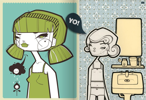
free design magazines

Just in case you weren’t aware, there’s a huge pool of free design magazines on the net; we meant those softcopy magazines you can either browse online or download (.PDF, .SWF) for offline viewing. Not only they have high quality content, each issue released is also free. We thought that’s generous of these folks. Today we want to present you with N Free Magazines for Designers. Even if you are looking for something to kill the spare time, we think these mags will help too. Full list after jump.

More? If you happen to know some good free magazines that we’ve missed. Feel free to leave a comment or contact us. We add it in.

Our Top Picks

GizMag

Weekly web magazine full of neat stuff. Every 3 months a free PDF is published with some of the past subjects, including interviews and artwork.

A List Apart

It’s not really a ‘magazine’ since it don’t come in .PDF or any downloable format. But it’s certainly a must-read for any web designers.

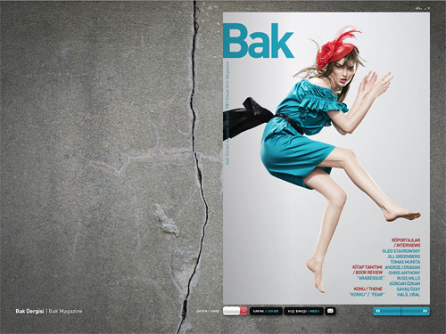
Bak Magazine

Artzmania

Veer Catalog

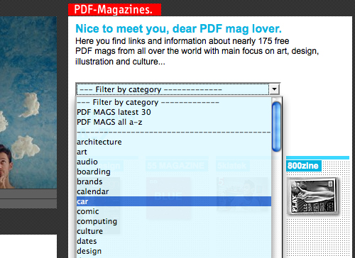
PDF Mags

Nothing but lots of PDF magazines, for free.

Destructed Magazine

Art- and Designmagzine in .PDF format released quaterly with each issue deals with a unique topic.

Magwerk

Love Pics

Komma

Delve Magazine

Delve was created to explore visual culture through experimentation in design, photography, illustration, and other related visual arts.

Kino Mag

CRU A Magazine

CRU A is a digital magazine about arts and culture.

Root Magazine

More Free Magazines

RevolutionArt Magazine

REVOLUTIONART international magazine is a publication delivered in pdf format as a collective sample of the best of the graphics arts, modeling, music, and world tendences. Deliver every 2 months.

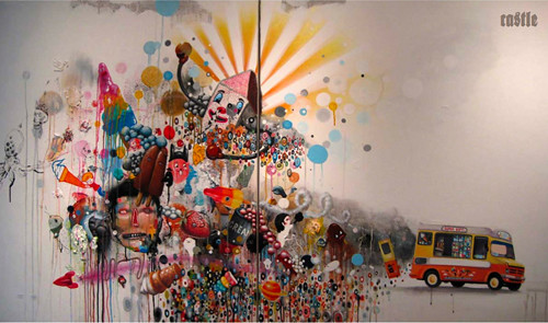
Castle Magazine

Castlemagazine is a pdf online mag which consists of the work of free Illustrators, Artists or other creative nerds.

ANTI

NTI Magazine aims to showcase outstanding visual content as an online magazine and also through future exhibitions all around the world.

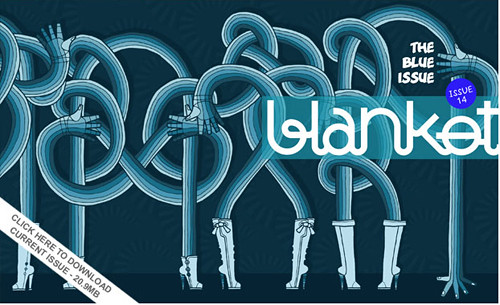
Blanket Magazine

Free PDF art + design + photography magazine that is released bi-monthly.

bitFUUL Magazine

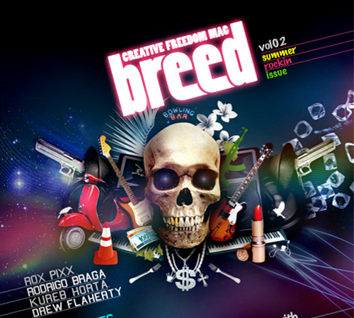
Breed Magazine

BREED Magazine covers art, fashion, music and ideas quarterly for free subscription.

Bloodwars Magazine

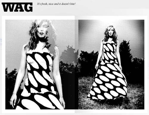
Wag

True Eye

Royal Magazine

Private journal of The KDU (Keystone Design Union), a Global Fraternal Creative Collective dedicated to creating and managing innovative design centric objects, brands and experiences.

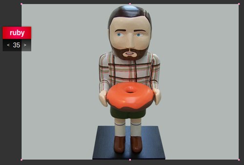
Ruby Mag

Sphere Magazine

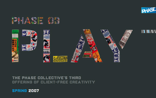
Phase Collective

NLF Magazine

Noname Magazine

Multilink Magazine

Kromag

TXTnein

Free pdf magazine made with submissions of graphic designers, photographers and artists over the world

Etel Magazine

We thought this is a good magazine, but too bad the English version is currently not available.

Proteus Mag

Online art and design magazine.

{ths} Beast Magazine

The bible of inspiration.

Bedifferent

CODE Magazine

Daheim Magazine

Design And Life

The minizine gathers information including design, lifestyle, fashion, trend and creative news from all over the world.

File Magazine

Publish images that treat subjects in unexpected ways.

Made in Street

2ndDesign Magazine

Where you can always find inspiration.

Link
"
Share/Save/Bookmark

the cloud

9/11 (2) Abbema_Jelte van (1) action heros (2) Afghanistan (1) Africa (1) African-American (4) Akakce_Haluk (1) Amorales_Carolos (1) Anderson_Pam (1) Anger_Kenneth (1) animation (1) anime (1) Arab (1) Arata_Michael (1) archaeology (1) architecture (2) Arranz-Bravo_Eduardo (1) art_market (1) avant garde (2) Aztatlan culture (1) Baier_Nicolas (1) Bailey-Beezy (1) Baldessari_John (1) Ballard_ J.G. (1) Balthus-Greg (1) Banerjee_ Sunandini (1) baroque (1) Bataille (1) beauty (1) Bell_Jonathan (1) Beloff_Zoe (1) Bergman_Robert (1) Black Atlantic (1) Bottero_Fernando (1) Burton_Time (1) C Magazine (1) Cai Guo-Qiang (1) Caravaggio (1) Castillo_Victor (1) Castro-Kelley (1) China (4) Christie's (1) Coching_Francisco (1) collage (1) Collins_Phil (1) comics (5) conceptual art (1) Condo_George (1) consumer_culture (1) cultural capital (1) culture_hacking (1) Cumberland_Sturart (1) Dali_Zhang (1) darklorddisco (1) Darwin (1) Davis-Stuart (1) death (1) Der Blaue Reite (1) design (1) digital (4) Dikovitskaya_Margaret (1) dolls (1) drawing (2) drawings (1) Dzama_Marcel (1) eco_culture (1) EcoMag (1) Eggleston_William (1) Egypt (2) El-Siwi_Adel (1) Emberley_Ed (1) Ethiopia (1) ethnography (1) Fairey_Shepard (1) Falnama (1) Fauxreel (1) feminist (6) film (12) film_score (1) Flickr (1) FlowTV (1) Folkert (1) food (2) Ford-Michael Lee (1) Fosik-AJ (1) Fournier_Marie (1) Furedi-Lily (1) gaphic design (1) gender (3) Genesis Beyer P-Orridge (1) Gentry_Nick (1) Germany (1) Giacometti_Alberto (1) global culture (1) Goltzius_ Hendrick (1) Gordon_Douglas (2) graffiti (2) graphic (9) graphic design (6) Gysis-Nicholaos (1) Harlem (1) Harris-Charles "Teenie" (1) Hass-Philip (1) Hirschhorn_Thomas (1) Hirst_Damien (1) history (1) Hitchcock (1) Hman_Jonathan (1) Holzer_Jenny (1) Hopper_Edward (1) Hulk-the Incredible (1) illustrated manuscripts (1) illustration (1) images (1) impressionism (1) India (3) Indonesia (1) installation (9) intersex (1) Iranian (2) Jalali_Bahman (1) Japan (2) Jongeleen_Jeroen (1) Kakebeeke_Karijn (1) Kandinsky_Wassily (1) KAWS (1) Kiefer_Anselm (1) Koelbl-Herlinde (1) Kritkos (1) Kuniyoshi_Utagawa (1) Lady GaGa (1) Landy_Michael (1) Latin America (2) Levin-Golan (1) Lewis_Ben (1) Lewis_Dave (1) Lewis_Wyndham (1) Linder_Richard (1) lithographs (1) low brow (2) Lozano_Lee (1) Macleod_Steve (1) Macphee_Graham (1) Manga (1) Marly-Pierre (1) Marvel Comics (1) Matta Clark_ Gordon (1) Maya (1) McCullin_Don (1) Meckseper_Josephine (1) media (1) medieval (1) Metrick-Chen_Lenore (1) Mexico (1) minimalism (1) Miss Van (1) modernism (1) Mooi Indie (1) Mottalini_Chris (1) Mueck_Ron (1) Murakami_Takashi (1) Museum of Contemporary Art (1) music animation (1) Muybridge_Eadwearch (1) network culture (1) new media (1) Obama (1) oil (1) Olav_Westphalen (1) Ortiz-Santiago (1) painting (28) Panton_Verner (1) paparazzi (1) Paranormal Activity (1) pep art (1) Philippine (1) photography (36) photoshop (2) Pilson_John (1) Pollock_Jackson (1) pop art (18) Portuguese (1) prints (1) Provost_Nicolas (1) public art (1) punk (1) Quinto_Felice (1) ready-made (1) recycling (1) recyled art (1) religion (1) Richardson-Earle (1) Richter_Gerhard (1) Roehr_Peter (1) Romantic art (1) Rostovsky_Peter (1) Rudolph_Paul (1) Ruff_Thomas (1) ruins (1) Russia (1) sculpture (2) seriality (1) Shaden-Brooke (2) Shonibare-Yinka (2) Singh Twins (1) Smith_Kiki (1) Sotheby (1) sound (1) Soviet style art (1) Spain (1) Spanish (1) story telling (1) Stout_Renee (1) street art (1) Suerkemper_Caro (1) Superman (1) Suriname (1) Swerman_Marshalll (1) tattoos (1) Te Wei (1) technology (1) territoriality (1) text (1) Thomas_Harnk Willis (1) Titian (1) Tolan_Canan (1) Tomic-Milica (1) Tommy Ga-Ken Wan (1) Turkey (1) TV (1) Twombly_Cy (1) ubran screens (1) vanities (1) Vertigo (1) Victorian (1) video (6) Violette_Banks (1) visuality (8) waste (1) weddings (1) Wessel-Henry (1) White-Charles (1) wiki (1) Wikipedia (1) Willardson_David (1) Wilson_Jane (1) Winterling_Sussane (1) work (1) Zeid_Fahrelnissa (1) Zero Art (1)

search this blog

Superfamous is the studio of interaction designer Folkert Gorter, primarily engaged in graphic and interactive design with a focus on networks and communities. Folkert holds a Master of Arts in Interactive Multimedia and Interaction Design from the Utrecht School of Art, faculty Art, Media & Technology, The Netherlands. He lives in Los Angeles, California."

Click on any text below to see Folkert's remarkable posts from the blog "but does it float."

but does it float