December 9, 2009

Michael Landy to Transform Gallery into Container for the Disposal of Works of Art

Artdaily.org - The First Art Newspaper on the Net: "


Michael Landy, Scrapheap Services, installation photograph at Tate Gallery, London , 1995. © The artist.

LONDON.- Michael Landy, one of the most acclaimed and respected British artists of his generation, transforms the South London Gallery into Art Bin, a container for the disposal of works of art. Over the course of the sixweek exhibition the enormous 600m³ bin will gradually fill up as people discard their art works in it, ultimately creating, in Michael Landy’s words, “a monument to creative failure”. Landy famously destroyed all his possessions in his 2001 installation Break Down ... More"
Share/Save/Bookmark

A History of Visual Culture

A History of Visual Culture: "
A History of Visual Culture
Western Civilization from the 18th to the 21st Century
Jane Kromm, Susan Benforado Bakewell


A History of Visual Culture is a history of ideas. The recent explosion of interest in visual culture suggests the phenomenon is very recent. But visual culture has a history. Knowledge began to be systematically grounded in observation and display from the Enlightenment. Since then, from the age of industrialisation and colonialism to today's globalised world, visual culture has continued to shape our ways of thinking and of interpreting the world.

Carefully structured to cover a wide history and geography, A History of Visual Culture is divided into themed sections - Revolt and Revolution; Science and Empiricism; Gaze and Spectacle; Acquisition, Display, and Desire; Conquest, Colonialism, and Globalization; Image and Reality; Media and Visual Technologies. Each section presents a carefully selected range of case studies from across the last 250 years, designed to illustrate how all kinds of visual media have shaped our technology, aesthetics, politics and culture.

About the editors


Jane Kromm is Professor of Art History at Purchase College, State University of New York and author of The Art of Frenzy: Public Madness in the Visual Culture of Europe, 1500-1850. Susan Benforado Bakewell is an independent curator and scholar, and has taught at the University of Texas, Arlington and Southern Methodist University. She is co-editor of Voices in New Mexico Art.

Contents


General Introduction
Jane Kromm

Part One: Revolt and Revolution
Introduction
Chapter 1: Helen Weston, 'The Politics of Visibility in Revolutionary France: Projecting on the Streets'
Chapter 2: Richard Taws, '19th c. Revolutions and Strategies of Visual Persuasion'
Chapter 3: Elizabeth Guffey, 'Socialist Movements and the Development of the Political Poster'
Chapter 4: Jelena Stojanoviæ, 'Avant-gardes and the Culture of Protest: The Use-Value of Iconoclasm'

Part Two: Science and Empiricism
Introduction
Chapter 5: Jane Kromm, 'To Collect is to Quantify and Describe: Visual Practices in the Development of Modern Science'
Chapter 6: Fae Brauer, 'The Transparent Body: Biocultures of Evolution, Eugenics, and Scientific Racism'
Chapter 7: Heather McPherson, 'Biology and Crime: Degeneracy and the Visual Trace'
Chapter 8: Nancy Anderson, 'Visual Models and Scientific Breakthroughs; The Virus and the Geodesic Dome: Pattern, Production, Abstraction and the Ready-Made Model'

Part Three: Gaze and Spectacle
Introduction
Chapter 9: Temma Balducci, 'Gaze, Body and Sexuality: Modern Rituals of Looking and Being Looked at'
Chapter 10: Jane Kromm, 'The Flâneur/Flâneuse Phenomenon'
Chapter 11: Elana Shapira, 'Gaze and Spectacle in the Calibration of Class and Gender: Visual Culture in Vienna 1900'
Chapter 12: Fae Brauer, 'The Stigmata of Abjection: Degenerate Limbs, Hysterical Skin and the Tattooed Body'

Part Four: Acquisition, Display, and Desire
Introduction
Chapter 13: Jane Kromm, 'To the Arcade: The World of the Shop and the Store'
Chapter 14: Amy Ogata, '”To See is to Know:” Visual Knowledge at the International Expositions'
Chapter 15: Susan Bakewell, 'Changing Museum Spaces: From the Prado to the Guggenheim Bilbao'
Chapter 16: Michael Golec, 'Design for a Display Culture: Domestic Engineering to Design Research'

Part Five: Conquest, Colonialism, and Globalization
Introduction
Chapter 17: Matthew Potter, 'Orientalism and its Visual Regimes: Lovis Corinth and Imperialism in the Art of the Kaiserreich'
Chapter 18: Marcus Wood, 'Marketing the Slave Trade: Slavery, Photography and Emancipation'
Chapter 19: Kim Masteller, 'Cultures of Confiscation: The Collection, Appropriation and Destruction of South Asian Art'
Chapter 20: Nada Shabout, 'Trading Cultures: The Boundary Issues of Globalization'

Part Six: Image and Reality
Introduction
Chapter 21: Joy Sperling, 'Multiples and Reproductions: Prints and Photographs in 19th c. England; Visual Communities, Cultures, and Class'
Chapter 22: Jane Kromm, 'Inventing the Mise-en-scène: German Expressionism and the Silent Film Set'
Chapter 23: Sarah Warren, 'The Reality of the Abstract Image: Re-thinking Spirituality in Abstraction'

Part Seven: Media and Visual Technologies
Introduction
Chapter 24: Brenda DeMartini-Squires, 'Now You See It: Disinformation and Disorientation on the Internet'
Chapter 25: Kathryn Shields, 'Carnival Mirrors: The Hermetic World of the Music Video'
Chapter 26: Matt Ferranto, 'Digital Self-fashioning in Cyberspace: The New Digital Self-Portrait'
Chapter 27A: Martin Danahay, 'Video Games: Art, Cinema and Interactivity'
Chapter 27B: Chris Kaczmarek, 'What You See is What You Get, or Reality is What you Take From It'


To see inspection copies, please select your region


To see prices, select your region
Paperback
Dec 2009
480pp, Bibliog, index, 120 bw illus
9781845204921


“This is the only treatment of visual culture with a broad temporal reach across a range of Western art practices that emphasizes the historical specificity of the visual experience. The approach – to highlight the key themes in visual culture and to illustrate these themes chronologically through carefully chosen case studies - is very effective.”
Kathleen Stewart Howe, Art and Art History, Pomona College
"
Share/Save/Bookmark

All City Writers

All City Writers: "
header myspace facebook twitter stumbleupon


The title, All City Writers, describes a vast research on the Writing movement, focusing particularly on the process of its exportation from New York to all of Europe during the 80s. The first part of the research analyzes how graffiti in media such as movies, videos, magazines, and books from New York influenced Europe. When images of the New York subway arrived in London, Paris, Munich and Amsterdam, a huge milestone was set: a first generation of European graffiti writers started to follow the letters, the method, the techniques, and the general lifestyle of New York in the 70s. The book, a massive volume of more than 400 pages, has been conceived as an imaginary newspaper. The chronicles it contains have not been penned by real journalists or narrators, but by people who define themselves as ‘writers’. In this volume, a chorus of uncensored voices in the first person reveal their knowledge of European cities, their infrastructures, interstices and neighbourhoods. This is the generation who in the last two decades of the 20th Century imported the countercultural phenomenon from New York commonly known as “Graffiti”.

At the outset, the obsessive repetition of a tag and the search for urban fame became a widespread and spontaneous act, an infinite ego trip that was rarely dissociated from the reproduction of the chosen letters. In these pages, European writers abandon the compulsive act of tagging for a moment, to narrate the city and cast a personal eye – not always detached – on the trains, the streets and the urban surroundings that common citizens generally cannot or will not acknowledge. The chapters that compose this book focus on specific themes, comparable to the sections of a daily newspaper, presented here as special reports on the New York subway, the European network or the first urban strongholds. The combination of these elements, including, among others, a detailed, in-depth description of the phenomenon’s explosion in Italy during the 90’s, provides a unique history of the variety of pathways they explored and documents the desires of an entire generation intent on describing and interpreting their cultural movement.Through historic and detailed documentation deriving from a singular urban episode, the New York City Subway, All City Writers wants to investigate the evolution and the consequences of a countercultural phenomenon, which in the last decades has provoked a change in the rules of aesthetics and communication in modern day society.
"
Share/Save/Bookmark

Saison Culture

from click opera -
Saison Culture

Today I'm flying Finnair to Japan. It's been a couple of years, but that's okay; I like to leave long enough between trips for Japan's unfamiliarity and difference to gather afresh. Even if it's just for a few precious hours, I want to feel like a Japan virgin again.


If every time feels a little like the first time, what did the first time feel like? Well, I landed in Japan in 1992 and 1993 into a very particular time, place and culture. Anthropologists of 20th century Japanese subculture call the thing I encountered 'Parco-Saison Culture'. Press them for more precision and they'll distinguish those terms: the Parco Culture period actually lasted from 1975 to 1985, and the Saison period from 1983 to 1993. So technically, I arrived in 'late Saison Japan'. All the artifacts I saw and bought (Poison Girlfriend CDs, Sony Walkmans, copies of CUTiE magazine) are technically Late Saison Japan artifacts, bought from late Saison stores (Wave Records, Libro books). Even unrelated phenomena -- the Animal of Airs shop Hibiki Tokiwa kept in Aoyama, the Nadiff bookstore -- had close family ties to the Saison empire. Nadiff, for instance, was started by the manager of the Libro bookshop inside the Ikebukuro branch of Parco. In British terms, that's as if Magma had started life as a spin-off from Selfridges.

The Japan I witnessed in the early 90s consisted of a small hill between Shibuya Station and Yoyogi Park. Here was my hotel, the Tobu. Here was chic department store Parco, and the club where I played my concerts, the Quattro, located (it seemed bizarre at the time) atop a department store and reached by escalators which traversed the deserted sales floors after closing time. Here also were LOFT and OIOI, the Parco art gallery, the record store Wave, and the arty basement bookshop Libro (Saison Culture loves Italian names, clearly). Not far off was Muji, another specialty store owned by Seibu.


I didn't know it at the time, but my first Japan visit was circumscribed almost entirely by a world conceived and invented by one man, Seiji Tsutsumi. A novelist, award-winning poet, and one-time member of the Japanese communist party, the young Seiji inherited the department store business from his father. Yasujiro Tsutsumi founded the Seibu empire in 1912. Typically for Japan, it consisted of a department store (Seibu) and a railway line to bring people to it (the Seibu line). Seiji's half-brother Yoshiaki Tsutsumi, a much tougher cookie, inherited ten times as much as Seiji did when the old man died in 1964, and by 1990 Yoshiaki was estimated by Forbes magazine to be the richest man in the world, thanks to property and transport holdings in bubble-era Tokyo. But Seiji was the artistic one. He retired in 1991, but the Japan I first encountered bore his mark the way quattrocento Florence bore the imprint of the renaissance princes. (Like the princes, these magnates were financially corrupt, allied to the mafia, and autocratic, but that's another story, and one Seiji was well out of by the time the prison sentences were being handed down.)


While his half-brother (and rival) did business the way businessmen all over the world do, refined and cultivated Seiji got to work creating something rather more poetic; a cultural environment in Shibuya, a blend of art and commerce. A department store doesn't need an excellent art bookstore in the basement, its own culture magazine (Bikkuri House, which published 130 issues between 1974 and 1985, and whose readers were called 'housers'), a concert venue, or a well-curated gallery. It doesn't need to commission arty postmodern posters and adverts from the likes of Eiko Ishioka, or music from Sakamoto and Hosono. But Seiji wanted Parco-Saison culture to have these facilities, and he had the power to make it happen. It's something we still see today -- look at the way Soichiro Fukutake, CEO of the Benesse Corporation, is revitalising the islands of the Seto Inland Sea with cultural patronage, art tourism, museums by international architects, and a series of commissions.


Seiji Tsutsumi left such a mark on shoppers that one blog account measures the separate impacts he had on a succession of Japanese generations, from the Baby Boomers and the Apathetics to the Juniors and the Blanks, and across a succession of cities (Parco brought Saison Culture to Sapporo in 1990, so the capital of Hokkaido lived its Saison a little later than Tokyo).

The YouTube clips reveal Parco's interest in sophisticated visual culture. I saw some of these commercials on my hotel TV during my first trips to Tokyo, but I didn't catch the earliest, purest phase of them. Art director Eiko Ishioka, for instance, was headhunted to make posters and TV spots for Parco in the late 70s after working for Shiseido. According to The Postmodern Arts by Nigel Wheale (Routledge, 1995): 'In 1978 she directed a one-minute TV commercial to promote Parco, a new Japanese department store. The ad showed Faye Dunaway wearing a black dress against a black background, peeling and eating a hard-boiled egg. The department store name was faded up for the last few seconds of the action, and a low-key voice-over uttered a sentence in broken English: 'This is film for Parco.' The ad was highly successful, and Eiko rationalized its effects in terms of performance art: eating an egg was a totally 'global act' done by rich and poor, advanced and developing peoples.'


Much later, in 2001, I signed a deal with the Parco label Quattro (located directly across the road from the Loft store on the same Shibuya hill) and made a record for them with Emi Necozawa. It was deeply uncommercial, and sold almost nothing, but the label didn't seem to care. Perhaps that huge empire -- 'Saison Culture' -- gave them a certain stability, even if it was achieved by sleight of hand. Four years later the police raided Seibu, and accusations of insider dealing and falsification of share ownership flew. The company was acquired by the owners of 7-Eleven. But Parco still stands on top of that hill in Shibuya. And although the money this time comes from a British University rather than Quattro-Parco concerts, the credit card that paid for my plane tickets carries the Saison logo.
"
Share/Save/Bookmark

Susanne M. Winterling


Artdaily.org - The First Art Newspaper on the Net: "
Susanne M. Winterling at GAK Gesellschaft fur Aktuelle Kunst Bremen


Susanne M. Winterling, 'Feather Eyes', 2009. ©Susanne M. Winterling.

BREMEN.- Susanne M. Winterling works primarily in film, collage and photography. The various media of the individual installations developed for each of the exhibition contexts lead, altogether, to a whole. Her works produce thereby a system of concrete references, without resulting in the telling of a distinct story or following any clear narrative threads. But instead, meaning emerges in a delicate weave of references; narrative volatilizing and branching out.

Literature, music, art, architecture and in particular film history become artistic materials for Winterling in just the same ways as everyday objects are staged in her works. They can be of a porcelain cup from an erstwhile family manufacturer, a bird's feather that changes colour in differing light, the delicate flying fiery spikes of a sparkler or of the historical inscription discovered at an exhibition site. These elements of cultural history and the everyday encircle and mould each of us. Thereupon they determine the actual moulding both of identity and individuality and general societal realities. Therefore when Winterling implements everyday objects, film, literature and historical references in her works, her choice tells us, on the one hand, of her personal proclivities. On the other hand they refer to material which is also (consciously or unconsciously) known to the observer and therefore can be filled with their own perceptions, without the necessity of attaining knowledge through linked facts that descend too far into detail.

Through a sensitive grasp of the atmospheres and histories of the discovered exhibition spaces Winterling links the references from various areas in poetically charged arrangements. For the exhibition '...dreaming is nursed in darkness' at the GAK, the inscription of a founders crest at the Weserburg building indicating the Teerhof's (Teer = tar, Hof = yard) original significance as a tar works for 15th century shipbuilding, a quote by French existentialist Jean Genet and the explosion of a powder tower on the site of the Teerhof in the 18th century form the starting point for a versatility of works developed specifically for this occasion.

Thus a close up of a burning sparkler is played back in 16mm film format, links to the historical incident of the destruction of the 'bride' as the former powder tower at the Teerhof had been called and refers to the immanent beauty of the destructive incidents of fire and explosion. Various sculptures of tar and feathers and another 16mm film, showing the colour-changing feathers in their dance-like movement in a dark room, refers back to the name-giving history of the Teerhof. But likewise it plays on the custom in the Middle Ages to 'tar and feather' as a punishment and form of torture. Here too, the aesthetic beauty of the motif is brought about in singular contradistinction to the image evoked by their history. Such subsidiary perceptions and the material of tar, so bound up with black, pervades and forms the appearance of the whole exhibition – in frames, film backgrounds or the gleaming fabric panels which accentuate the elongated spaces of the GAK and are thus duplicated by the Weserburg tunnel situated in front of the door.

Another element of the presentation is formed by a modified cast of the crest/emblem inscription fixed above the tunnel entrance of the Weserburg. It alters the original formulation from 'männlichen festen Wollen' (firm masculine want) to 'weibliches festes Wollen' (firm feminine want) indicating at once the absurdity of such gender specific attributions upon which character traits are based. Furthermore it elucidates on the propagation of anachronistic, male and female connotations, which pervade our language to this day and pose questions on societal power structures. The historical crest is countered by a quote by Jean Genet the French existentialist that not only donates the title of the exhibition at GAK but is to be found again as an inscription in the presentation ('A man must dream a long time in order to act with grandeur, and dreaming is nursed in darkness'). In this way the exhibition title acts as a copula between the individual elements of the presentation such as the numerous reflecting surfaces, which are to be found in themselves – in the thought, that dreams are not only nurtured from positive and light, but can grow quite equally from the darkness, that 'grandeur' develops only where the debate also admits the violent aspects of things and where beauty is accorded its dark side.

Susanne M. Winterling (born, 1970) lives in Berlin. After taking part in international group exhibitions such as the Berlin Biennial 2008, at the Museum für Gegenwartskunst Basel and the Kunsthalle Malmő and solo presentations in Vienna, St. Louis and Tokyo the presentation at GAK Gesellschaft für Aktuelle Kunst is her first institutional solo exhibition in Germany. The exhibition has been created in cooperation with the Badischen Kunstverein Karlsruhe.
"
Share/Save/Bookmark

"Punk’ Era of Graphic Design

Emigre Compilation Revisits ‘Punk’ Era of Graphic Design | Underwire | Wired.com: "

Emigre Compilation Revisits ‘Punk’ Era of Graphic Design

emigre-composite-a-1200
A woman took the stage of a Seattle design conference in 1995 and smashed a computer to smithereens with a sledgehammer. Passions were raging full-boil during the so-called legibility wars, as tradition-based graphic designers — in love with clean, simple advertising and magazine layouts — looked with horror at a new generation of font designers and illustrators who used computer programs as a tool for shredding, shattering, melting and otherwise rethinking the way words and pictures came together to sell a message.
On hand to report on the fracas was Émigré magazine. Over the course of 69 issues that now reside in New York City’s Museum of Modern Art, the magazine championed experimentalists and routinely got lambasted by the old guard for advocating “the cult of ugly.”
Émigré No. 70: The Look Back Issue hits bookstores Saturday. Weighing in at nearly 6 pounds, the 512-page volume costs $50 and comes bundled with a booklet of fiery letters to the editors, a CD-ROM with music and videos published by Émigré and a commemorative poster.
The book, edited by Émigré co-founder and designer Rudy VanderLans and published by Gingko Press, features all the eye-popping magazine covers (including those pictured above and below), plus essays and interviews from The Designers Republic, Allen Hori, Rick Valicenti, Vaughan Oliver, Mr. Keedy, Lorraine Wild and others.
VanderLans likens the late 20th century’s computer-inspired design movement to “punk music in the ’70s and ’80s.”

“Punk was a direct reaction to glam/stadium rock (Bowie/Roxie Music, etc.),” he told Wired.com in an e-mail interview. “Did it change music? Not really. Glam rock is still being made. But punk added something to the mix. It expanded our idea of what music was, and how it could be recorded, performed and distributed. I think that’s the legacy of design of the ’90s. We reacted to an institutionalized Modernism that had gone stale.”
VanderLans talks about DIY design, the punk-rock aesthetic and the game-changing Apple Macintosh in the interview below.
emigre-composite-1346-b


read the rest of the interview at Emigre Compilation Revisits ‘Punk’ Era of Graphic Design | Underwire | Wired.com:

Share/Save/Bookmark

Hendrick Goltzius' 'Jupiter and Antiope'

Artdaily.org - The First Art Newspaper on the Net: "
Hendrick Goltzius' 'Jupiter and Antiope' Among Highlights of Sotheby's Sale


Hendrick Goltzius, 'Jupiter and Antiope', 1612. (122 x 178 cm.), 48 x 70 inches. Est. $8/12 million. Photo: Sotheby's.

A monumental masterpiece (48 x 70 in. (122 x 178 cm)) by the great 17th century Dutch artist
Hendrick Goltzius will be offered early next year in Sotheby’s sale of Important Old Master
Paintings in New York on 28 January 2010. Goltzius’ paintings are extremely rare and Jupiter
and Antiope is the most important by the artist to appear at auction in more than 25 years
est. $8/12 million, £4.8/7.3 million). Executed in 1612, the painting was formerly in the collection
of Abraham Adelsberger (1863-1940), a German Jew who was one of the most successful toy
manufacturers of the early 20th century. In the year following Adelsberger’s death, his
son-in-law was forced to sell the painting to the Nazi leader Hermann Göring to ensure the
safety of his family. The painting was recovered by the Allied forces in 1945 and sent to the
Dutch Government. Over the course of the next 64 years, the painting was loaned to three
institutions in the Netherlands, including the Frans Hals Museum in Haarlem, where it hung
from 1985 until this year. In March 2009, the painting was restituted to the heirs of its original
owner, Abraham Adelsberger. Prior to exhibition and sale in New York in January, the painting
will be exhibited at Sotheby’s London from 4 –9 December 2009.


George Wachter, Co-Chairman of Sotheby’s Old Master Paintings Department Worldwide said,
“As Goltzius only started painting in 1600 and died seventeen years later, only a limited number
of significant oils were executed by this great master and the present work ranks among his
greatest. It evokes an enormous reaction due to its size and subject matter, and the impact
of its eroticism speaks for itself.”


Hendrick Goltzius (1558-1617)

In 1600, when he abandoned printmaking and began painting, Goltzius was the most famous
engraver in the Netherlands and perhaps all of Europe. His style had evolved from the extreme
contortions of Haarlem Mannerism toward the more classicizing influence of Italy, where he
had lived from 1590 to 1591. However, it was painting, not printmaking, that was considered
the highest art form, and at the dawn of the new century Goltzius decided to take up the
challenge of working in a new medium. In the seventeen years before his death he painted
more than 50 pictures and was soon recognized as the premiere painter in Haarlem, surpassing
his rival Cornelis Cornelisz. van Haarlem. Paintings by Goltzius can be found in major museum
collections including the Rijksmuseum, The Los Angeles County Museum, the National Gallery
of Art, Washington, D.C., the Museum of Fine Arts, Boston, and the Fitzwilliam Museum,
Cambridge, among others. The first major retrospective of the artist’s work was organized
by the Metropolitan Museum of Art, The Toledo Museum of Art and the Rijksmuseum in 2003.

Jupiter and Antiope

Jupiter and Antiope is one of a number of large-scale paintings of nudes that Goltzuis executed
between 1600 and 1617. In the present mythological scene, Goltzius captures the moment before
Antiope, the beautiful daughter of Nycteus and Thebes, was seduced by Jupiter in the form of
a satyr. The highly charged scene depicts Antiope asleep on her bed, propped up by a stack
of gorgeously-colored cushions. She is naked apart from her earrings, a pearl necklace and a
tiny strip of fabric that accentuates rather than hides her nudity. At her feet kneels Jupiter in
the form of a satyr, his look and attitude that of a half-wild creature consumed by lust. He
stares fixedly at Antiope, his mouth in a rigid grin and his arms and back tensed, literally ready
to pounce. In his right hand he holds an apple and some pears - an offering to Antiope – which,
like the grapes in the foreground, are symbols of fertility. Scattered throughout the composition
are other references to the event that is about to occur, including the inverted slippers beside
Jupiter's knee and the overturned chamber pot, both of which represent female sexual organs.
In the background of the painting is a somewhat ambiguous figure – a young satyr - who holds
his left index finger to his lip while lightly pinching Antiope’s nipple. Scholars have debated
the meaning of the gesture – possibly communicating caution to Jupiter to be quiet, or perhaps
he is pointing at his mouth symbolizing Jupiter’s intent to devour Antiope.

Provenance

Abraham Adelsberger was born on 23 April 1863 in Hockenheim, Germany. He established
himself as one of the most successful manufacturers of tin-plate toys in the early 20th century,
while at the same time nurturing a passion for art and building an impressive gallery at his home
in Nuremberg. As fears for his safety increased, he fled Germany in 1938 and joined his daughter
and her family in Amsterdam - managing to take several of his paintings with him, including
Jupiter and Antiope. Following his death two years later, his son-in-law was forced to sell the
painting to Hermann Göring to ensure the safety of his family. His family went into hiding from
1943 onwards and all survived. Adelsberger’s wife, Clothilde, was deported to Bergen-Belsen,
but also survived the concentration camp and the war. Göring, who assembled one of the mos
t important collections of Old Masters in Europe at the time, had at least four works by or
attributed to Goltzius in his collection, of which the present work was the most important.
He took the painting to Carinhall, his country retreat in the north of Brandenburg, and in early
1945, he ordered the evacuation of his entire art collection to protect it from the advancing
Russian forces. The following year, the painting was recovered by the Allied forces and taken
to the Central Collecting Point in Munich. From there, as was the common practice, the painting
was returned to the country from which it has been stolen - the Netherlands. Over the course
of the next several decades, the painting was loaned to several Dutch institutions including the
Kunsthistorisch Institute, Utrecht (1952-78), the Groningen Museum, Groningen (1979-85) and
the Frans Hals Museum (1985-2009), which was particularly apt given that Goltzius lived much
of his adult life in Haarlem. In March 2009, the painting was restituted to the heirs of Abraham
Adelsberger by the Dutch government.


Share/Save/Bookmark

December 3, 2009

Michael Arata, Remember


Kristi Engle Gallery,
5002 York Ave.
Highland Park, CA 90042
323.472.6237
kristi@kristienglegallery.com
"Officials today took the rare step of publicly releasing photos of women connected in some way to convicted murderer Bill Bradford, hoping the public might help identify them. While detectives believe some have been murdered, they can't say conclusively and hope publicity might bring witnesses - or the women themselves - forward."
-Los Angeles Times, July 25, 2006

In his first project with Kristi Engle Gallery, artist Michael Arata uses the medium of painting as a process of photographic manipulation. This series of works entitled Remember features 54 small paintings (acrylic on panel), each a portrait of a young woman, hair carefully rendered but with faces blanked out. The hairstyles are all of a kind fashionable in the late 70s and early 80s and place the women in a distinctive place in time. That place tragically coincides with the 1984 arrest and conviction of William Bradford for the murders of two young women in the Los Angeles area.

Posing as a freelance fashion photographer, Bradford persuaded women to model for him, luring them to the Mojave Desert and other desolate locations. Immediately after his arrest, while searching Bradford's apartment, the police discovered a collection of chilling photographs, 54 in total, of pretty young women posing for the camera. With no information that could identify any of the women, all the police could do was wonder who they were and what had happened to them. In 2006, detectives looking through a cold case file found the photographs. Using the web as a way to disseminate the images more widely than was possible at the time, they were published on the LAPD website with a hope of identifying any of the women. These posted photographs became the basis for Arata's project, an exploration of identification and memory through the means of photographic portraiture. Inevitably, the meaning of these photos has shifted since their initial creation and continues to shift following Arata's appropriation and, no doubt, beyond that. Law enforcement posted these photographs in order to individually identify the women, but as a collection, the portraits are also an expression of group classification. The group of people it presents to us today reveals a cultural drive to construct a self image infused with a fear of victimization.

A hairstyle is often a very carefully chosen component of one's own personal identification. Arata's careful rendering of the hair, while blocking out the women's faces, brings into focus individual difference just as it obliterates identity. They are all different and all, somehow, the same. Our knowledge that all of these women are possible victims lends a distinct eeriness to the absence of smiling faces. As the set of photographs consolidates these individual women into a unified group, feelings towards them and their fate as individuals can be kept at arm's length, lessening our personal discomfort. Arata aims to remind us of this cultural habit so that this negation of personal comfort becomes a discomfort in itself. Distinctly aware of the potential missteps this project is fraught with, Arata's aim is to present a sincere memorial to these women in such as way as to critically examine our understanding of the nameless victim as a cultural effect.

Michael Arata has been active in the Los Angeles art community since 1987. His most recent work was exhibited at the San Diego International Art Fair. His work has been shown both locally and internationally.
Share/Save/Bookmark

November 29, 2009

Video Vortex V – Day 1

Institute of Network Cultures Blog: "
System Flaws and Tactics
Screen shot 2009-11-21 at 15.54.53 Video Vortex V

After the opening speech by Bram Crevits (Cimatics) and Geert Lovink (Institute of Network Cultures), the 5th edition of Video Vortex kicked off at the amazing Atomium in Brussels.

The first session addressed System Flaws and Tactics. This session was inspired by the inherent errors, disabilities and restrictions of online video technology that often conduct our behaviour but can also provide inspiring new insights. Liesbeth Huybrechts and Rudy Knoops gave the first presentation of the day, titled ‘Playing that video’. They work at the School of Communication and Multimedia Design (C-MD) in Genk, Belgium, where they lead the research group Social Spaces, on the topic of social, societal and spatial issues, using the internet as a tool and interface.

Video Vortex V Video Vortex V

After pointing at the rules of play and playground, and building on theory of tactics and strategy as defined by De Certeau, the presenters explored the diffuse difference between work and play in the age of new media. Knoops pointed out that Google employees get to spend 20% of their time ‘playing’, i.e. working on their own projects. In his recent work, Julian Kuecklich refers to this conflation of play and labour as ‘Playbour’. Knoops and Huybrechts showed impressive work by the C-MD students in Genk, and called for play as a critical tool, and encouraged a practice of tactical play.

Video Vortex V

Next up was Brian Willems, who lectures in media culture as well as British and Irish Literature at the University of Split, Croatia. In his talk, titled ‘Blindness: the inability of YouTube to read itself’, he argued that online video often demonstrates blindness,as theorized by Paul de Man, Agamben, and Proust, and rather than being readable. He presented two cases of online video: The Rodney King Story, and Natalie Bookchin’s installation ‘Mass Ornament’, which was presented by the artist herself at the Video Vortex conference in Split (2009).

According to Willems, the Rodney King story demonstrates how difficult it is to read video. In the video, King, lying on the ground, tried to get up when the police attacked him again. The police later stated that they considered his standing up as aggressive behaviour. The video does not clarify whether this was indeed the case. Therefore, Willems argues the video demonstrates its blindness. In this respect, the work by Natalie Bookchin is equally hard to read. Inspired by the chorus lines of the Tiller Girls, she selected and sorted YouTube dance videos so they form a chorus line, through montage, soundtrack and composition. Willems pointed out that the amount of screens, layers and motifs makes this video hard to read, and therefore confronts you with its illegibility or blindness.

Video Vortex V Video Vortex V

Rosa Menkman, artist, VJ and PhD candidate at KHM presented her Glitch Studies Manifesto, in which she called for a more drain approach of technology studies, which includes the study of its flaws and failures:

1. The dominant, continuing search for a noiseless channel has been, and will always be no more than a regrettable, ill-fated dogma.
2. Dispute the operating templates of creative practice by fighting genres and expectations!
3. Get away from the established action scripts and join the avant-garde of the unknown. Become a nomad of noise artifacts!
4. Use the glitch as an exoskeleton of progress.
5. The gospel of glitch art sings about new models implemented by corruption.
6. The ambiguous contingency of the glitch depends on its constantly mutating materiality.
7. Glitch artifacts are critical trans-media aesthetics.
8. Translate acousmatic noise and soundscapes into acousmatic video and videoscapes to create conceptual synesthesia.
9. Speak the totalitarian language of disintegration.
10. Study what is outside of knowledge, start with Glitch studies. Theory is just what you can get away with!

The session ended with a presentation by the artist Johan Grimonprez, who guided the audience through his You-tube-o-teque. And while the sphere of the Atomium was shaking because of an autumn storm, grimonprez created his own whirlwind, going from the history of the remote control and the invention of zap-proof commercials, to hitchcock pastiches and the swine flu vaccine scandal from 1976. (www.zapomatik.com)
Video Vortex V Video Vortex V


Go to the Institute of Network Cultures blog for reports on day 2:

Video Vortex V – Day 2 – Online cinema

Video Vortex V – Day 2- Politics of Online cinema


Share/Save/Bookmark

November 28, 2009

Exhibition by Influential Designer Verner Panton

Artdaily.org - The First Art Newspaper on the Net: "
Tokyo Opera City Art Gallery Shows Exhibition by Influential Designer Verner Panton


A visitor sits on Verner Panton's 'Phantasy Landscape' which is made of fabric, wood and foam rubber, at the Tokyo Opera city art gallery in Tokyo. Reuters/Kim Kyung-Hoon.

TOKYO.- Who is Verner Panton? If you are enquired about this name, you might think of Panton Chair that is the streamlined form with the first single-unit cantilevered chair made of molded plastic. Verner Panton, who was born in Denmark, immediately established himself at the forefront of avant-garde design in Europe in 1960's in consequence of producing famous design collaborating with industrial producers.

His works were not limited to single objects, but extend to the design of entire space like the product design, architecture – few of which were actually built – and the exhibition. At a glance, extravagant forms and the use of strong, intense colours might typify his work, but what he retained throughout his work was a systematic approach to design. For this reason, his interest didn't only reach to the furniture but entire space. Unfortunately, his singular design has not ever been reflected as the subject of the research in the design history, because of just the singularity.

This exhibition is the retrospective to present Panton's extensive and diverse work that the Vitra Design Museum planed and Tokyo Opera City Art Gallery originally organized. This exhibition focuses nearly 150 works of furniture, lightings, textiles, models, sketches and videos, etc., from the Vitra Design Museum collection, between the mid-fifties and the mid-seventies during which time he had a substantial influence upon the direction and development on international design. This exhibition, which presents his total space design, would provide the opportunity to look back on the past and look to the future in the modern design.

Starting with Panton Chair, the exhibition presents Panton's passion and history for his experiment and challenge.

First furniture collection
The exhibition shows Panton's first furniture collection – Tivoli Chair (1955) produced for the restaurant in Tivoli Park, Denmark; S-Chair, wooden single-unit cantilevered chair; Chair Cone (1958) which has the unique structure consisted of the conical metal shell and the pivot on a cross shaped metal base; the chair shaped like trumpet, Chair Trumpet, made of steel wire – that impressed his experimental passion and artistic stamp over the world.

Modular Furniture
Pantonova, which is consisted of a chromium-plated steel wire, could be assembled in various ways. This exhibition presents them that were very influential in the 1960's.

Panton Chair
Panton Chair is the icon in the design history in 20th for the first single-unit cantilevered chair made of molded plastic. The exhibition shows the changes of plastics to enable beautiful streamlined chair and the development process of it.

Experiential space: Phantasy Landscape and space consisted of design items by Panton

Phantasy Landscape
For this international tour, Vitra Design Museum reconstructed Phantasy Landscape room, which was the legendary interior represented at 'Visiona 2' exhibition in Cologne Furniture Fair in 1970. The Bayer chemical company commissioned 'Visiona 2' exhibition, the concept of which was the futuristic interior. In 'Visiona 2' that was hold at the ship on the river Rhein, 24,000 visitors came in 4 days. In this exhibition, you could experience to be surrounded by 360°Panton's design in the cave-like colourful space around 8m x 6m x 2.4m.

Space by Panton
The extraordinary furniture of Verner Panton suggests the unique usage of space for example 'Flying Chair' (1963) floating in space like the hammock; 'Living Tower' (1968) which is a reclining chair with different sitting positions. In addition, 'Ring Lamp' (1969), which was produced for 'Visiona 2,' fills the wall and the ceiling with colours, light and geometrical form so that creates the optical space.
"
Share/Save/Bookmark

Peter Roehr

Artdaily.org - The First Art Newspaper on the Net:
"Stadel Museum Examines Works by Frankfurt Artist Who Died at Age 23


Peter Roehr, 'Untitled' (FO-116), 1965 (Detail). Collection Dr. J. Lindenberger, Frankfurt. Photo: Günter Maniewski-Atelier. ©VG Bild-Kunst, Bonn 2009.

FRANKFURT.- When the Frankfurt artist Peter Roehr died in 1968 at the young age of 23, he left behind several hundreds of works in which he pursued exclusively the idea of serial repetition. From found commonplace materials he created ever new montages of photographs, text, typography, objects, sound, and film probing the concept of redundancy. Roehr abstained from both making a statement and sticking to an individual style. His formal repertory is deliberately reduced to the selection of an object, the definition of the number of its repetitions, and their arrangement. The element used is still recognizable, although it becomes absorbed in the series, so that the original form and color scheme are subjected to a potentiating effect. Last year, the Städelsche Museums-Verein was able to acquire the artist’s ten Schwarze Tafeln (Black Panels) for the museum, a central work in which the method of a non-narrative serial arrangement of identical objects culminates.

Now that four decades have lapsed, the commonplace nature of Roehr’s works pushes to the fore even more vehemently. They become amazingly enhanced and turn into narrative formulations oscillating between ready-made and seriality, pop and minimal art, everyday life and abstraction. The exhibition Peter Roehr illustrates that Roehr’s strict formalism is much more complex and eloquent than it seems to be at first glance.

Share/Save/Bookmark

New Work by Dave Lewis

Artdaily.org - The First Art Newspaper on the Net


Dave Lewis, 'New Forest' (image from Field Work), 2009.

HAMPSHIRE.- ArtSway announced an exhibition of new work by Dave Lewis bringing together photographs and video. Dave Lewis is a photographer and filmmaker interested in identity and how people belong to a place. In making his work, Lewis attempts to act as both an ethnographer (the study of the characteristics of different people) and an artist.

Field Work is a new body of artwork inspired by the idea of the artist as a ‘stranger’ who visits a place or site to gather first-hand evidence as research. Lewis has explored the New Forest in Hampshire and Newtown in mid-Wales for Field Work. Both of theses places are linked by their rural locations and also by their cultural differences to Lewis’ hometown of London. By analyzing and contrasting these areas, interviewing residents and documenting events such as local festivals and carnivals, Lewis examines the role of the individual within society and how that individual identifies themselves with a place.

For his exhibition at ArtSway Lewis will present a series of large-scale landscape photographs taken on the outskirts of Newtown, and Sway. These photographs are taken from the viewpoint of the ‘stranger’ as he surveys a place that is new to him. Alongside these photographs are two filmed ‘journeys’ showing the ‘stranger’ as he conducts his research into Newtown and Sway, including interviews with local people.

Other images in the exhibition will include photographs Lewis took at carnivals in Wales and the New Forest that further explore ideas of identity and belonging to a place.

Dave Lewis gained a BA Hons in Film and Photographic Arts from the Polytechnic of Central London in 1985. Recent exhibitions and screenings include: Photo-ID Norwich Forum, 2009; Hybridity, Sainsbury Centre for Visual Arts 2008; Anywhere but Here, Southwark Gallery, 2008; AfterShock, Sainsbury Centre for Visual Arts, 2007. Dave Lewis lives and works in London and is currently Visiting Research Fellow in the Department of Anthropology, Goldsmiths, University of London.
"
Share/Save/Bookmark

November 27, 2009

Nineteen New Paintings by Damien Hirst on View at White Cube

Artdaily.org - The First Art Newspaper on the Net: "


Damien Hirst, The Crow, 2009. Oil on canvas. Triptych. Each: 98 13/16 x 69 1/8 x 4 5/16 in. (251 x 175.5 x 11 cm) (incl. frame) © the artist. Photo: Prudence Cuming Associates Ltd. Courtesy White Cube.

LONDON.- White Cube presents nineteen new paintings by Damien Hirst. The exhibition will be staged at White Cube Mason’s Yard and White Cube Hoxton Square.


At White Cube Hoxton Square, Hirst will present a group of paintings, which include three triptychs from 2007-09, each depicting crows shot in mid-flight against blue skies, with outspread wings and violent splatters of red paint across their bodies. In the four triptychs on show in the lower ground floor at White Cube Mason's Yard, these crows reappear, as omens of bad news. They often share the space with ghost-like figures, skeletal forms and objects, including chairs, lemons, knives, animal skulls, wine glasses or a scorpion.

Rudi Fuchs begins his essay with the following reading of these paintings: 'When I try to pinpoint what the visual mood is in Hirst’s new images, I am constantly reminded of Beckett – not of any one story in particular, though subject matter is important, but of the austere dryness of the language. Sentences are interrupted, lines are broken, observations are fragmented in order to direct us slowly towards a clearer perception of the real.'

Damien Hirst, Insomnia, 2008. Oil on canvas. Triptych. 
Each: 98 13/16 x 69 1/8 x 4 5/16 in. (251 x 175.5 x 11 cm)
(incl. frame) © the artist. Photo: Prudence Cuming Associates 
Ltd. Courtesy White Cube.

Damien Hirst was born in 1965 in Bristol, UK. He lives and works in London and Devon. He has participated in numerous group exhibitions including ‘Into Me / Out of Me’, P.S.1 Contemporary Art Center, New York (2006), ‘In-A-Gadda-Da-Vida’, Tate Britain (2004), the 50th Venice Biennale (2003) and ‘Century City’, Tate Modern (2001). Solo exhibitions include ‘No Love Lost’, The Wallace Collection, London (2009), ‘Requiem’, Pinchuk Art Centre, Kiev (2009), ‘For the Love of God’, Rijksmuseum, Amsterdam (2008), Astrup Fearnley Museet fur Moderne Kunst, Oslo (2005), Museum of Fine Arts, Boston (2005) and Archaeological Museum, Naples (2004). He received the DAAD fellowship in Berlin in 1994 and the Turner Prize in 1995. An exhibition of the artist’s private collection, ‘Murderme’, was held at Serpentine Gallery, London in 2006.
"
Share/Save/Bookmark

November 26, 2009

Interpreting urban screens

Interpreting urban screens « NAIT5: "

Noviembre 24, 2009

Posted by christian saucedo 


Interpreting urban screens
Anthony Auerbach

Abstract
Large-scale video screens in urban settings suggest new possibilities and challenges for city authorities and regulators, architects, advertisers and broadcasters as well as for cultural curators and producers. While this potential remains largely untested, it is clear that urban screens establish new sites for the negotiation between commercial, public and cultural interests. This paper takes a critical approach to the question of defining the role of culture in urban media, highlighting the shifts in the relations of representation mediated by video and the complexity of the urban media environment.

Location

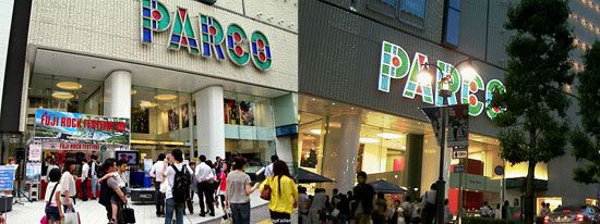
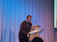
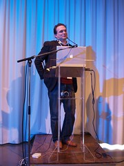
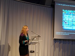
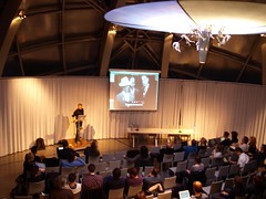
The conference ‘Urban Screens’[1] aimed to explore the potential of large-scale video screens in public places as venues for artistic and cultural programming. My contribution sketched a critical approach which did not start out with simplistic notions such as ‘electronic billboard’, ‘outdoor TV’ or ‘public art’. I aimed to locate large-scale video installations in the spectrum of television and video networks which populate and, increasingly, construct the urban fabric. The photographic documentation which accompanied my talk (and which accompanies this article) is an inventory of the urban phenomena of video familiar to everyone. It demonstrates how a small set of technologies supports a large set of applications at different scales: from the infrastructure of terrestrial, satellite, cable and mobile networks, through the equipment of the home, the workplace, commercial and public spaces, to systems of surveillance and control. Each photograph offers a document which would repay analysis, tracing the web of interactions between of media and architecture, subject and commodity, identity and desire, the city and its phantasmagoria.

My starting point, ‘Video as Urban Condition’[2] is the working title of an exhibition and archive project which begins as an inquiry into how video shapes urban experience.

Fascination

The fascination of urban screens — like that of television when it appeared in the twentieth century — is the allure of a medium in search of a message, with the potential to create audiences. The large-scale LED video screens which are becoming an increasingly common sight on the urban landscape have been put there principally for advertising, information or entertainment. In practice, the installations have usually combined all three purposes in various proportions and sometimes admitted other content such as artists’ videos or interactions with members of the public. Urban screens are made possible when the interests of those who control the exhibition space, the technology, the potential content streams and the potential revenue streams converge. Urban screens today are experimental enterprises. Emerging in complex environments, urban screens will challenge the assumptions of artists, curators, urban- and media theorists as well as the expectations of city authorities, advertisers and broadcasters.

Subjectivity

Whereas the discussion of ‘urban screens’ has been dominated by screen technology and what could or should be done with it, mainly from the point of view of professional producers, I would like to emphasise the multiplicity of subjectivities implicated by video in urban environments. ‘Video as Urban Condition’ aims to explore how our knowledge, perception and fantasy of urban environments are mediated by video. That means understanding not only the influence of the flickering screens which surround us, but also the image-world of the city transmitted, for example, by TV drama or by the urban playgrounds of video games such asSimCity or Grand Theft Auto. The games, moreover, assert the position of the viewer as the first person subject acting on or in the virtual city. Similarly, with the spread of consumer-level camcorders and video-equipped mobile phones, it is important to acknowledge how the subject of ‘video’ (‘to see’) is the one who holds the camera as much as the one who watches the screen (even — especially — if in the act of recording, the two cannot be separated). Video has become a medium of mass-production — that is, mass-participation — as well as mass-consumption.
Figure 1: Rome, 2005: This act of video recording dislodges the traditional custom and saves a coin
Figure 1: Rome, 2005: This act of video recording dislodges the traditional custom and saves a coin.
Video is no longer the exclusive domain of professionals. Video offers the tourist, for example, a means of both mediating consumption (of technology and of travel) and authenticating experience (even when the preoccupation with filming would seem to compromise the experience promised by the idea of travel). One could also argue that, despite the aura which clings to the profession ‘artist’, the way artists use video has more in common with the amateur than with the professional broadcaster or film-maker.

Origins

Which brings me to the origin of ‘Video as Urban Condition’ as a project: against the background of the myriad uses of video in daily life, the effort to assimilate and contain video within the norms and institutions of art (and thereby to defend the status of the artist as such) begins to seem absurd. We are accustomed to the idea that video images assert a multitude of different claims, that the same LCD, LED or plasma screens, cathode ray tubes or projectors convey a multitude of different messages and will ambush us in almost any location. To be sure, the video screen captures eyeballs, but does not by itself dictate a particular mode of viewing in the way the traditional media, framings and settings of art works instruct the viewer to adopt an appropriate mode of reverent attention. With video, we are capable, indeed trained, to adjust our subjectivity, perception and receptivity instantaneously — almost continuously — as quickly as we flip the channels with a remote control, or, for that matter, as we walk down a commercial street.

This condition seemed to me to present a more exciting set of possibilities for producing and showing videos than the battle for artistic credibility. What strategies would emerge if we could create the chance for artists to make use of the existing video infrastructure? In other words, not to offer a TV set on a plinth in a white cube or a projection in a black box, but instead to remove the protection of such institutions, expose the work in urban space and accept this less reliable frame; to accept that video will not support an artist’s claim to exceptional status or of itself command respect.

That seemed like a good idea and I began to investigate the practical possibilities. It will be no surprise to you, that in probing the structures which regulate public space and artistic production, I soon discovered the naivety of my proposition. Hence the need to interpret the site-specific nature of urban video installations and to understand what I have called the relations of representation.

Dialectics

To interpret ‘urban screens’ and assess their potential, it seems to me vital to acknowledge the dialectics of screens, that is, their double and contradictory functions. Broadly understood, a screen is there to display something, but also to conceal something. A screen acts only as ifit were a passive receiver of an image — as some would have it, merely the reflection of the society in which it is found. In the urban context especially, it is also a transmitter. As one agency claims, outdoor advertising is the ‘last remaining truly broadcast medium.’ (ClearChannel, 2005)[3]

Considering the relations of representation, we could ask: What is the ideological function of the screen? In other words: What and whose assumptions are concealed by the screen? Many speakers at the ‘Urban Screens’ conference invoked the notion of ‘public art’, but without suggesting that there is any agreement about how artists and public identify themselves or one another, by whom, and by means of what technology and what institutions this relationship is mediated. Instead of assuming, as the original call for papers seemed to suggest, that urban screens are culturally deprived spaces which need to be served by self-styled cultural producers and curators, we could ask: Who says what is culture?

In Manufacturing Consent, Chomsky and Herman discuss the notion of culture which is propagated by broadcast media in the United States. They write:
There are exceptional cases of companies willing to sponsor serious programmes, sometimes the result of recent embarrassments that call for a public-relations offset. But even in these cases the companies will usually not want to sponsor close examination of sensitive or divisive issues — they prefer programmes on Greek antiquities, the ballet, and items of cultural and national history and nostalgia. Barnouw points out an interesting contrast: commercial-television drama [i.e., soap operas] ‘deals almost wholly with the here and now, as processed via advertising budgets,’ but on public television, culture ‘has come to mean “other cultures.” … American civilisation, here and now, is excluded from consideration.’ [Barnouw, 1978, p. 150]
Television stations and networks are also concerned to maintain audience ‘flow’ levels, i.e., to keep people watching from program to program, in order to sustain advertising ratings and revenue. Airing program interludes of documentary-cultural matter that cause station switching is costly, and over time a ‘free’ (i.e., ad-based) commercial system will tend to excise it. Such documentary-cultural-critical materials will be driven out of secondary media vehicles as well, as these companies strive to qualify for advertising interest, although there will always be some cultural political programming trying to come into being or surviving on the periphery of the mainstream media. (Chomsky and Herman, 1988, p. 18)
Many of the ‘cultural’ initiatives we heard about during the conference appeared to reassert this model, that is, the tendency towards displaying ‘culture’ as if it were separate from the conditions of its reproduction, and the acceptance of a marginal position. At least, this appeared to be the basis for the alliances between cultural workers and corporate sponsors, technology providers and media- or advertising agencies in developing cultural programmes for urban screens.[4] At most, culture provides a utopian affirmation of the power relations which govern public- and media space. Indeed, one could argue that such affirmation helps to define, secure and defend the realm of culture as such.

From this perspective, it is not really these power relations which are hidden by the screen. When you look, for example, at the ‘Big Screen’ in Manchester’s Exchange Square (which, incidentally, carries no advertising in its programme) you see that the logos of the local authority, the Royal Bank of Scotland, the BBC and Philips are permanently branded on the installation. What is concealed by large-scale video screens in public places, one could argue, are precisely the shifts in the relations of representation which have occurred since Chomsky analysed network television.

There is not enough space to develop the argument fully here, but I would like to make two comments which suggest how the analysis could go: one about the role of video in conditioning urban space and urban subjects; the other about communications technology and the privatisation of public space.

Producing and seducing a public

The multiplication of channels in the home which seemed to threaten the cohesion of television’s audience and its status as a mass-medium prompted advertisers and broadcasters to target their audiences in public. However, in taking TV from point-of-sale installations and the captive audiences of station platforms, airports, queues and waiting rooms into ‘public space’ means entering more complex urban environments. It means facing the decline of urban community spaces which, since the 1950s, has often been blamed on television. ‘Public space broadcasting’[5] is a meaningful proposition only if it can produce a public. This requires not just programming a screen, but all the forces of urban planning, architecture, policing and so on.

The role video surveillance in this process hardly needs to be underlined. CCTV is perceived to be the ideal means of making cities safe, in other words: of excluding ‘undesirables’ from specific places and helping to moderate the behaviour of individuals. What I would like to point out is how video display and surveillance installations can work together in the so-called regeneration of public space.

Surveillance and display both have a share in the fascination of television, that is, its ability both to connect the viewer to a distant place and to distance the viewer in the present location. As part of the apparatus of controlling urban spaces, video surveillance facilitates the ways in which a video display can assemble, interpellate and commodify a public. In turn, the fascination projected by display facilitates the acceptance of video surveillance by seducing the individuals under surveillance with their own images on screen — permitting individuals the voyeuristic pleasure of seeing themselves where they stand — at a distance. The ‘narcissism’ of the Exchange Square audience was mentioned as a key factor in successful programming for that public screen. This narcissism is echoed whenever we walk under the monitor placed at the entrance to a shop or station to reassure those it welcomes and warn those it excludes with the announcement: You are being watched. TV still flatters, even without the promise of fame.

The private in public

Large-scale video screens tend to adopt modes of address which are familiar from television, outdoor advertising or the cinema. Each has its history and retains some of its rhetorical force, but all are increasingly undermined by the integration of entertainment, information and mobile communications technology. ‘Public space’ as the natural environment for one-to-many communications and the shared spectacle is now intersected by private and personal channels: connecting you to your choice of media streams , to other individuals in other places, or simply immersing you in the interior urban movie produced with the soundtrack of a portable music player.

Figure 2: New York City, 2005: A momentary story-within-a-story on a public urban screen

Big screen initiatives have emerged which invite you to use your mobile phone to display poems, photographs or messages, to vote or bet on what you see. The efforts of commercial and cultural producers alike to incorporate mobile communications technologies into the big screen appear to be motivated by the anxiety to bind the potentially autonomous user to its regime. For a while, the screen becomes the audience. It receives your message or image and projects a flattering notion of public address. The ‘interactive’ message, like the radio dedication, still goes out only to ‘friends and family’, whom you could contact directly whenever you want.

At the same time, electronic ‘interactivity’ divides the audience into those who have, and those who do not have access to the technology. It flatters the haves (while, if possible, harvesting data) and advertises the product to the have-nots. For increasingly integrated media and communications corporations there is no conflict in using the public screen to promote the private consumption of video in public places, just as broadcasters frequently use the screens in public places to advertise what they have to offer the home viewer.

Potential

At the end of her book Ambient Television: visual culture and public space, Anna McCarthy reflects:
The TV screen embodies all the political contradictions that come with art in public spaces, as well as those more particularly associated with television. As a public medium governed by private logics, as a private medium that comes to stand in for the public it addresses, as a private, domesticated possession that regularly appears in, and alters, public places, television spans utopia and critique as it brings modes of spectatorship into the illegible terrain of the everyday. These video installations … involving TV’s commercial logics in a dialogue with radical alternatives to consumerism[6] [provide] us with provocative and instructive inkblots not for thinking about how to begin making rapprochements between utopian and critical ideas about TV, social change, and public space but for recognizing and exploiting how much these rapprochements are already available in the spaces of everyday life. This means taking seriously the site-specific power relations which become visible in ambient television installations. Only then can we devise policies, programs, and practices that develop these ideas about sociality and collectivity that TV’s presence in such places raises. (McCarthy, 2001, p. 251)
In my view, discovering the potential of urban screens also means taking seriously the inattentive viewer, the perpetually distracted subject which video and the city have created.

Consumer culture is often blamed for the homogenisation of urban experience, through domination of global brands and the insidious effects of the entertainment industry and media corporations. Video is at the heart of this process and is perhaps the pre-eminent means of propagating norms. Video has also produced the subjective hybrids which we know as infotainment, docudrama and reality-TV as well as the many unnamed alterations of perception and behaviour mediated by the video screen. Such alterations certainly influence, but do not necessarily bind the ever-growing number of people who are video-makers. The distribution of video technology suggests the possibility engendering as many approaches as there are users. Among them, perhaps, ways of contesting the conventions and habits which video persuades us are second nature, and means of making the specificities of urban experience perceptible.

About the author

Anthony Auerbach’s work revolves around the critique of knowledge and representation. Like drawing, which is at the heart of Auerbach’s artistic practice, video is a medium which cannot be claimed exclusively by art and therefore calls for an interdisciplinary approach. As initiator and director of the project ‘Video as Urban Condition’ (2004–), Auerbach brings together a range of interests and concerns: interpreting relationship between video, architecture and urban geographies (following his MA studies and his involvement in teaching architectural design); critical models for the understanding the relationships between technology and representation (following his PhD study ‘Structural Constellations’); practical and collaborative models for work in public (following his involvement in devising and curating exhibitions and events).

E-mail: contact [at] video-as [dot] org

Notes

1. Urban Screens: discovering the potential of outdoor screens for urban society’, Amsterdam 23–24 September 2005. An international conference organised by Mirjam Struppek in co-operation with the Institute of Network Cultures (Department of Interactive Media at the Hogeschool van Amsterdam) welcomed a wide range of speakers to discuss the uses of large-scale LED screens ‘that increasingly influence the visual sphere of our public spaces in urban settings’. In the words of the organisers, the conference would ‘investigate how the currently dominating commercial use of these screens can be broadened and culturally curated. Can these screens become a tool to contribute to a lively urban society, involving its audience interactively?’ Contributions from academics, curators and artists were complemented by talks by architects, technology providers, advertising agencies and broadcasters.


3. Clearly, that also applies to billboard-sized LED screens, although it will be interesting to see what influence the increasing segmentation of air time on such screens will have in the future.

4. Chomsky and Herman do not point out that when advertising itself becomes the chief cause of ‘switching’, then cultural matter can present itself again as a means of binding the audience to the flow. On a commercial channel, cultural matter has the ambivalent status of advertising the fact that there remains unsold air time.

5. This is what the BBC calls its project, and in so doing expresses a ambition shared by commercial operators.

6. McCarthy has just discussed two video works in public places: a self-organised intervention by TWCDC (Together We Can Defeat Capitalism) in which the activist group paid $800 to insert a message in the San Francisco public transport information system, and an elaborately conceived interactive video art installation by Dara Birnbaum, commissioned by the developer for a new shopping mall. In the latter case, the interactive element depended on the movement of shoppers, who, apparently not attracted either by the video installation or the shops, failed to show up. The supposedly critical rhetoric of the installation thus was bound to share the success or failure of the commercial enterprise.

References

ClearChannel, 2005. ‘Glossary’ at
http://www.clearchannel.co.uk/dsp_glossary.cfm?fuseaction=ViewGlossary&letter=B accessed 21 September 2005.
 
Erik Barnouw, 1978. The Sponsor. New York: Oxford University Press

Noam Chomsky and Edward S. Herman, 1988. Manufacturing consent: the political economy of the mass media. New York: Pantheon Books

Anna McCarthy, 2001. Ambient Television: visual culture and public space. Durham: Duke University Press

Copyright ©2006, First Monday
Copyright ©2006, Anthony Auerbach
Interpreting urban screens by Anthony Auerbach

First Monday, Special Issue #4: Urban Screens: Discovering the potential of outdoor screens for urban society http://firstmonday.org/htbin/cgiwrap/bin/ojs/index.php/fm/article/viewArticle/1546/1461
cómo citar: AUERBACH, Anthony, Interpreting urban screens, First Monday, Special Issue #4: Urban Screens: Discovering the potential of outdoor screens for urban society (February 2006), URL: http://firstmonday.org/htbin/cgiwrap/bin/ojs/index.php/fm/article/viewArticle/1546/1461
"
Share/Save/Bookmark

'Radicalizing Refamiliarization,' Journal of Visual Culture (8:2)

joygarnett: 'Radicalizing Refamiliarization' in Journal of Visual Culture (8:2): "


Stones, originally uploaded by Joy Garnett (archive). (2003) 60 x 78 inches. Oil on canvas.


I am pleased to announce the publication of my recent article,
'Radical Refamiliarization,' co-authoredwith John Armitage
(University of Northumbria) for The Journal ofVisual Culture
(Volume 8, number 2, August 2009). The issue is out at last.
It is a Special Issue in which a number of scholars,educators,
curators, activists and artists respond to a questionnaire on
Barack Obama and visual mediation. Several of the article
(including ours) engage the interesting developments surrounding
Shepard Fairey's Obama posters
.

Click the link to download our article; see also the full
Table of Contents on SAGE:

Radicalizing Refamiliarization, [PDF] Journal of Visual Culture 8:2 (Fall 2009).
JVCcover


contributors:
Editorial, Marquard Smith; W.J.T. Mitchell; ShaunMichelle Smith; Dora Apel; Raimi Gbadamosi; Rajagopalan Radhakrishnan;Toby Miller; Jacqueline Bobo; Julian Myers, Dominic Willsdon and MaryElizabeth Yarbrough; Lauren Berlant; Marita Sturken; Lisa Cartwrightand Stephen Mandiberg; John Armitage and Joy Garnett; Victor Margolin;Joanna Zylinska; Gayatri Chakravorty Spivak; Anna Everett; JulianStallabrass; Ellis Cashmore; John Carlos Rowe; Robert Harvey; CurtisMarez; Cynthia A. Young; Nicholas Mirzoeff.
"
Share/Save/Bookmark

Sunrise Outside City Dumpsite - Addis Ababa, Ethiopia

ZORIAH - A PHOTOJOURNALIST AND WAR PHOTOGRAPHER'S BLOG:
Zoriah_photojournalist_war_photographer_ethiopia_addis_ababa_pollution_smog_garbage_trash_dump_20091102_0227
The sun rises through the haze of pollution and smoke from burning landfills outside of a city dumpsite in Addis Ababa, Ethiopia.

Share/Save/Bookmark

November 24, 2009

Deborah Willis and Carrie Mae Weems talk about beauty

from Cnylink Local News:

Nov 24

Nancy Keefe Rhodes 11/24/09More articles


Deborah Willis’ new book, ‘Posing Beauty,’ uses Ken Ramsay’s 1970s-era portrait of Susan Taylor for the cover.


“Where are you going next?” I asked Deborah Willis, who sat at the end of a table piled with copies of half a dozen of her 27 books in the hallway at Light Work Gallery.


“Well tomorrow I’m going to Paris for a signing and then after that to Zurich for another book event,” she smiled. All the copies of Willis’ two new books – “Posing Beauty: African American Images from the 1890s to the Present” and a slender volume centering on Michelle Obama, which she later said she’d had to agree to do as part of a package deal to get the beauty book a publisher – had sold out.


In the hallway before the talk, under Willis’ hands on the table’s edge sat a single copy of her book with Carla Williams, “The Black Female Body: A Photographic History” (2002). It’s out of print now and the few hard-to-come-by copies on-line are collector-grade pricey. The SU Bookstore was managing the book table sales and had pulled out what other Willis volumes they had on hand for this signing event, which was how this single stray copy of “The Black Female Body” had surfaced. Willis herself quickly bought it and then called Williams on her cell to report she’d found a copy: even Williams hadn’t had one, which made me feel not so bad I’d gotten there too late.


Willis – premier photohistorian, writer, curator, Chair of Imaging at NYU’s Tisch School of the Arts, MacArthur “genius” fellow, and art photographer (she has a joint photo exhibition with her son, Hank Willis Thomas, “Progeny,” touring nationally through 2010) – travels a lot. The artist and photographer Carrie Mae Weems says she has never encountered anyone with a matching work ethic. The two are very old friends and last Thursday night they sat together before a packed audience in the auditorium off Light Work Gallery and talked at length about Black beauty and how that is represented in photography, something both have wrestled with and written about and made images of for years now, and ranged as well into how work really starts in the classroom with students’ questions and how Michelle Obama – once cast as fist-bumping terrorist – has changed things. The Willis-Weems talk was the final event in the Central New York Mellon Humanities Corridor’s “Key Words in Visual Culture,” a semester-long project carried on jointly among Syracuse University, the University of Rochester and Cornell.


Carrie Mae Weems was recently featured on PBS’ Artists in the 21st Century series and herself has work in the Getty Museum, the International Center of Photography and MoMA. She said Thursday that she had known Willis over 30 years.


“When I was starting out, I put out a call to find women who were working around the country – Black women in photography – Deb was one of the first who replied,” she said.


Willis was in town last year right after the presidential election at the invitation of the Southside Initiative, consulting about creating community history projects. She gave an afternoon talk at the Dunbar Center, showing slides and commenting on some of the early black-and-white photos of local photographer Marjory Wilkins. Later that day she spoke on campus, introduced by Weems, and showed slides from the beauty project, which she’d just then sent off to the publisher. She said she wished she’d seen Wilkins’ images before she’d finished the book, fastening particularly on one of a young man arm-in-arm with two well-dressed ladies and another of five young women posing before a plate-glass window after church. She again showed slides Thursday night, beginning with a 1850 poster for a runaway slave named Dolly, whom her owner so wanted back that he acknowledged publically that she was “rather good looking.”


Willis has been researching her new book actively for over a decade, seeking out images from the 1890s to the present that document how both photographers and their subjects have defined, challenged and reinvented concepts of beauty for women and men in African-American communities, how a “pose” is constructed (as well as how images actively “pose” – as in, to offer or assert – certain visual traits as beautiful) and the ways that beauty is essentially empowering. But her engagement with these questions dates from her childhood when she “watched the transformation women experienced in my mother’s beauty shop in our home in North Philadelphia,” and from her years as an undergraduate student who’d just started working at the Schomberg Center in Harlem and noticed there seemed to be very little material on Black beauty. Criss-crossing the country since then, getting a second masters in art history, she found there turned out to be a lot more material than she’d thought. She is looking always for stories, she says.


At 234 pages, “Posing Beauty” has a compact introduction that asks about both sides of the photographic interaction – what the photographer and what the subject each sought; how the Black community went about making its own store of images to counter the sea of mainstream hostile, stereotypical images in the U.S.; and references Elaine Scarry’s astute and thoughtful “On Beauty and being Just” (2001), the best working-out that I know about how we recognize the beautiful and the sources of our urge to reproduce that – to make images. The book also has a detailed index, a bibliography, end-notes – but mostly it has pages and pages of images, both men and women, and to sit with it for even a little while is to see why Publisher’s Weekly calls it “ground-breaking.”


These are divided into four sections, each of which contains wonderful surprises. Early in “Constructing a Pose,” there’s a snapshot of the musician Valaida Snow, a musician caught in a Nazi dragnet in World War II Europe who died in a concentration camp; here, she’s conducting a small orchestra during a show in London in 1934, dressed in a shimmering, slinky white gown, baton raised. There is the image of Zora Neale Hurston by Carl Van Vechten that she liked because it made her “look mean and impressive.” There’s also Cartier-Bresson’s “Easter Sunday Morning, Harlem, 1947” and Theodore Fonville Winans’ “Dixie Belles, Central Louisiana, 1938” – two girls in straw hats placed just so – and Eve Arnold’s “Malcolm X, Chicago, 1961” (also on the book’s back cover) and Bruce Davidson’s “Bodybuilder on Venice Beach, 1964,” one of the slides Willis showed last Thursday with a droll comment about the woman in the picture taking the bodybuilder’s picture while her husband looked on, helpless, hands jammed in his pockets. Some of the images in “Posing Beauty” have appeared already in “The Black Body” and it’s a pleasure to see they will have a new lease of life in this new book.


The second section is titled “Body and Image” and features a range of images that actively assert “beauty” and the power it confers – a 1930s image entitled “Brown Madonna and Child,” Prentice Polk’s portrait of Lena Horne posing with the Tuskegee Airmen in the 1940s before a statue of George Washington Carver, Eve Arnold’s “Integration Crisis” – two schoolgirls side by side in a restroom, one Black, at a party to introduce students in Virginia in 1958.


Part III, “Modeling Beauty and Beauty Contests,” brings together a number of Willis projects, including photo-documentation of Black beauty parlors and barber shops, some from the 1920s, and her question to find visual records of Black beauty contests, the earliest of which occurred over a century ago. This section also contains images of men posing with jazzy new cars and women engaging in cultured pursuits such as the image of a Black woman giving piano lessons to a young girl that W.E.B. DuBois took the Paris Exposition in 1899 as part of his project to present African Americans in radically new visual settings. And here is Jurgen Schadberg’s 1955 shot of the singer Miriam Makeba in a Johannesburg nightclub with her natural hair, which Willis has spoken of as having an electrifying effecting in those years. Part IV comprises a number of color plates, from portraits of public figures to the increasing use of self-portraiture such as Renée Cox perched in the Statue of Liberty’s crown.


Light Work videotaped the talk that Willis and Weems had so that may be available at some point. Meanwhile, there’s “Posing Beauty,” worth the wait.


Nancy covers the arts. Reach her at nancykeeferhodes@gmail.com.
"
Share/Save/Bookmark

the cloud

9/11 (2) Abbema_Jelte van (1) action heros (2) Afghanistan (1) Africa (1) African-American (4) Akakce_Haluk (1) Amorales_Carolos (1) Anderson_Pam (1) Anger_Kenneth (1) animation (1) anime (1) Arab (1) Arata_Michael (1) archaeology (1) architecture (2) Arranz-Bravo_Eduardo (1) art_market (1) avant garde (2) Aztatlan culture (1) Baier_Nicolas (1) Bailey-Beezy (1) Baldessari_John (1) Ballard_ J.G. (1) Balthus-Greg (1) Banerjee_ Sunandini (1) baroque (1) Bataille (1) beauty (1) Bell_Jonathan (1) Beloff_Zoe (1) Bergman_Robert (1) Black Atlantic (1) Bottero_Fernando (1) Burton_Time (1) C Magazine (1) Cai Guo-Qiang (1) Caravaggio (1) Castillo_Victor (1) Castro-Kelley (1) China (4) Christie's (1) Coching_Francisco (1) collage (1) Collins_Phil (1) comics (5) conceptual art (1) Condo_George (1) consumer_culture (1) cultural capital (1) culture_hacking (1) Cumberland_Sturart (1) Dali_Zhang (1) darklorddisco (1) Darwin (1) Davis-Stuart (1) death (1) Der Blaue Reite (1) design (1) digital (4) Dikovitskaya_Margaret (1) dolls (1) drawing (2) drawings (1) Dzama_Marcel (1) eco_culture (1) EcoMag (1) Eggleston_William (1) Egypt (2) El-Siwi_Adel (1) Emberley_Ed (1) Ethiopia (1) ethnography (1) Fairey_Shepard (1) Falnama (1) Fauxreel (1) feminist (6) film (12) film_score (1) Flickr (1) FlowTV (1) Folkert (1) food (2) Ford-Michael Lee (1) Fosik-AJ (1) Fournier_Marie (1) Furedi-Lily (1) gaphic design (1) gender (3) Genesis Beyer P-Orridge (1) Gentry_Nick (1) Germany (1) Giacometti_Alberto (1) global culture (1) Goltzius_ Hendrick (1) Gordon_Douglas (2) graffiti (2) graphic (9) graphic design (6) Gysis-Nicholaos (1) Harlem (1) Harris-Charles "Teenie" (1) Hass-Philip (1) Hirschhorn_Thomas (1) Hirst_Damien (1) history (1) Hitchcock (1) Hman_Jonathan (1) Holzer_Jenny (1) Hopper_Edward (1) Hulk-the Incredible (1) illustrated manuscripts (1) illustration (1) images (1) impressionism (1) India (3) Indonesia (1) installation (9) intersex (1) Iranian (2) Jalali_Bahman (1) Japan (2) Jongeleen_Jeroen (1) Kakebeeke_Karijn (1) Kandinsky_Wassily (1) KAWS (1) Kiefer_Anselm (1) Koelbl-Herlinde (1) Kritkos (1) Kuniyoshi_Utagawa (1) Lady GaGa (1) Landy_Michael (1) Latin America (2) Levin-Golan (1) Lewis_Ben (1) Lewis_Dave (1) Lewis_Wyndham (1) Linder_Richard (1) lithographs (1) low brow (2) Lozano_Lee (1) Macleod_Steve (1) Macphee_Graham (1) Manga (1) Marly-Pierre (1) Marvel Comics (1) Matta Clark_ Gordon (1) Maya (1) McCullin_Don (1) Meckseper_Josephine (1) media (1) medieval (1) Metrick-Chen_Lenore (1) Mexico (1) minimalism (1) Miss Van (1) modernism (1) Mooi Indie (1) Mottalini_Chris (1) Mueck_Ron (1) Murakami_Takashi (1) Museum of Contemporary Art (1) music animation (1) Muybridge_Eadwearch (1) network culture (1) new media (1) Obama (1) oil (1) Olav_Westphalen (1) Ortiz-Santiago (1) painting (28) Panton_Verner (1) paparazzi (1) Paranormal Activity (1) pep art (1) Philippine (1) photography (36) photoshop (2) Pilson_John (1) Pollock_Jackson (1) pop art (18) Portuguese (1) prints (1) Provost_Nicolas (1) public art (1) punk (1) Quinto_Felice (1) ready-made (1) recycling (1) recyled art (1) religion (1) Richardson-Earle (1) Richter_Gerhard (1) Roehr_Peter (1) Romantic art (1) Rostovsky_Peter (1) Rudolph_Paul (1) Ruff_Thomas (1) ruins (1) Russia (1) sculpture (2) seriality (1) Shaden-Brooke (2) Shonibare-Yinka (2) Singh Twins (1) Smith_Kiki (1) Sotheby (1) sound (1) Soviet style art (1) Spain (1) Spanish (1) story telling (1) Stout_Renee (1) street art (1) Suerkemper_Caro (1) Superman (1) Suriname (1) Swerman_Marshalll (1) tattoos (1) Te Wei (1) technology (1) territoriality (1) text (1) Thomas_Harnk Willis (1) Titian (1) Tolan_Canan (1) Tomic-Milica (1) Tommy Ga-Ken Wan (1) Turkey (1) TV (1) Twombly_Cy (1) ubran screens (1) vanities (1) Vertigo (1) Victorian (1) video (6) Violette_Banks (1) visuality (8) waste (1) weddings (1) Wessel-Henry (1) White-Charles (1) wiki (1) Wikipedia (1) Willardson_David (1) Wilson_Jane (1) Winterling_Sussane (1) work (1) Zeid_Fahrelnissa (1) Zero Art (1)

search this blog

Superfamous is the studio of interaction designer Folkert Gorter, primarily engaged in graphic and interactive design with a focus on networks and communities. Folkert holds a Master of Arts in Interactive Multimedia and Interaction Design from the Utrecht School of Art, faculty Art, Media & Technology, The Netherlands. He lives in Los Angeles, California."

Click on any text below to see Folkert's remarkable posts from the blog "but does it float."

but does it float